Lorem ipsum dolor sit amet
Scope
Introduction
This document sets out the scope for the testing and evaluation of the Bulb websites. For efficient reporting, not every page and component is included in the scope. However, samples are chosen such that each important design pattern is covered.
In the report, issues are divided into General and Components categories. General issues may include problems with — for example — document structure, or absence of focus styles. Components issues organize advice by isolated component, such as a tab interface or dialog window. The scope simply defines the URLs at which issues may be found.
The marketing site
1. Home page
- URL
- https://bulb.co.uk
- Included
-
- Header and navigation
- Content structure
- “Get a Quote” form
- Graphics
- Charts
- Footer



2. About → Our energy
- URL
- https://bulb.co.uk/energy
- Included
-
- Page structure
- Providers chart
3. About → Careers
- URL
- https://bulb.co.uk/careers
- Included
-
- Page structure
- Imagery
- Open roles collapsible sections

4. About → Business
- URL
- https://bulb.co.uk/business
- Included
-
- Page structure
- Imagery
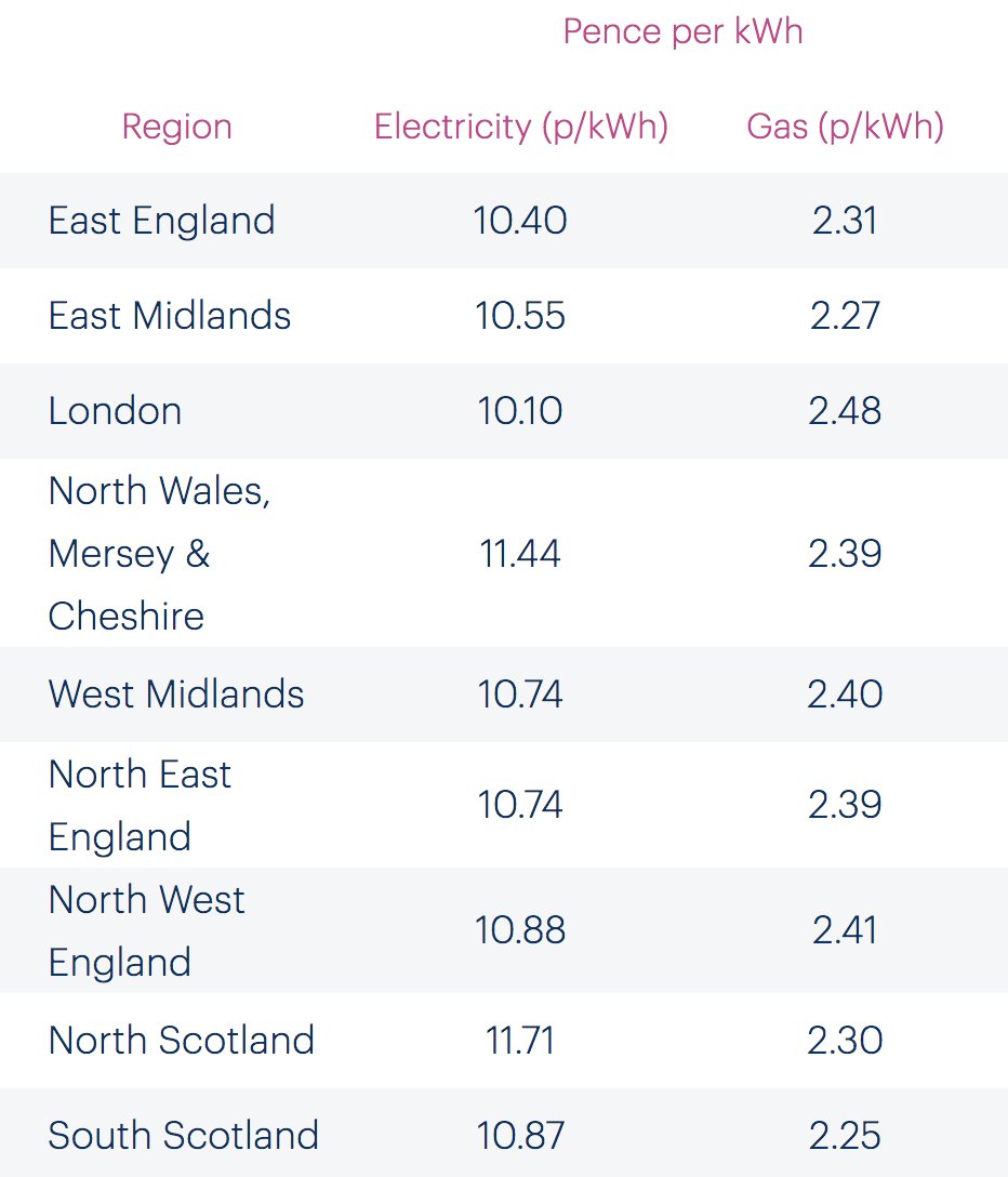
- Pence per kWh table
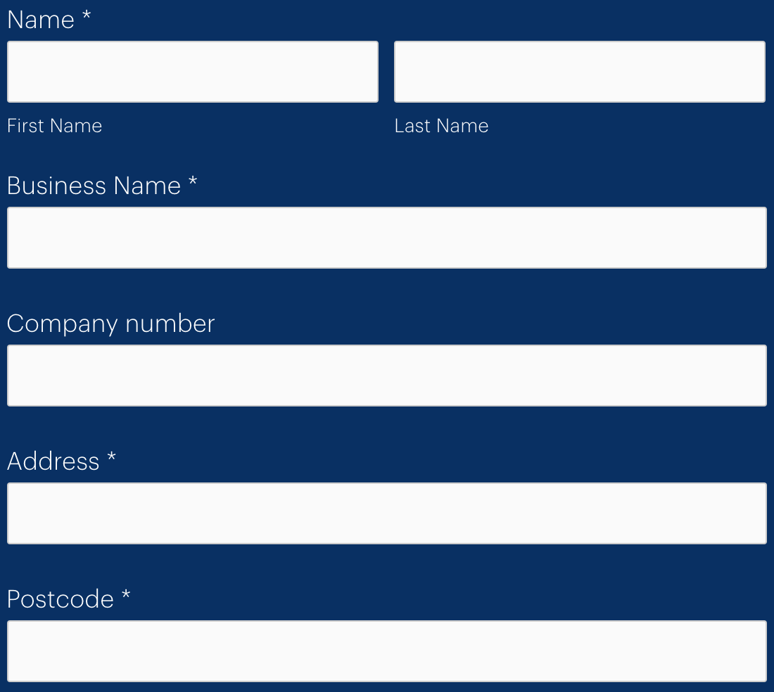
- “Get a Quote” form and error mechanism
The join site
1. Welcome page
- URL
- https://join.bulb.co.uk/join/quote
- Included
-
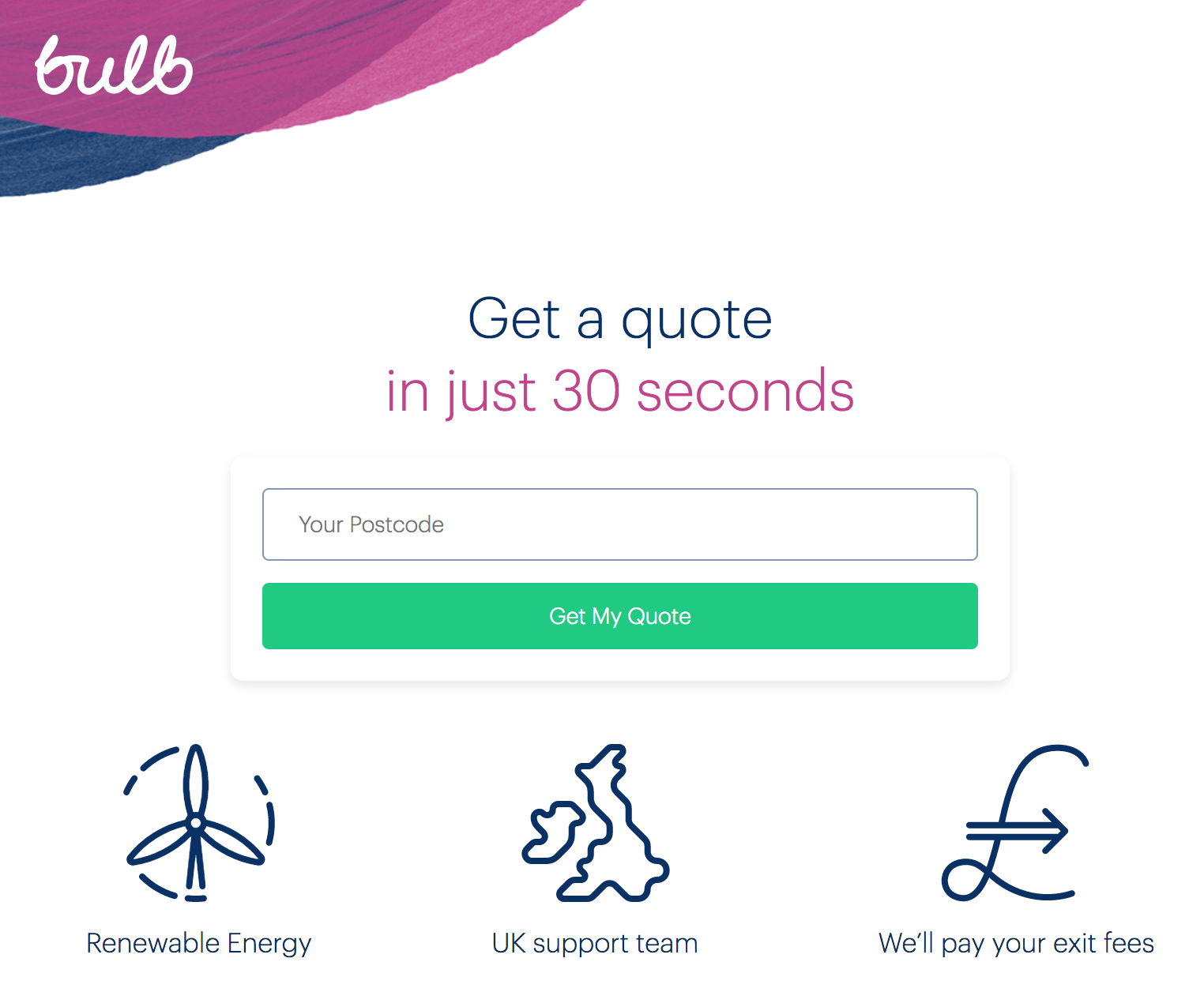
- The logo/header
- Main heading
- The “Get My Quote” form and error mechanism
- The three captioned graphics
2. Questions
- URL
- Starts from https://join.bulb.co.uk/join/questions/my-energy
- Included
-
- Each question page’s heading
- Each question page’s form functionality
- Continue buttons
- Back links
3. “Switch Now” page
- URL
- https://join.bulb.co.uk/join/quote-result
- Included
-
- Heading structure
- Timeline navigation (small screens only)
- Buttons and links
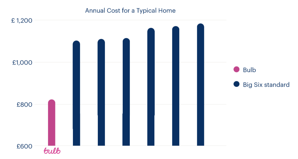
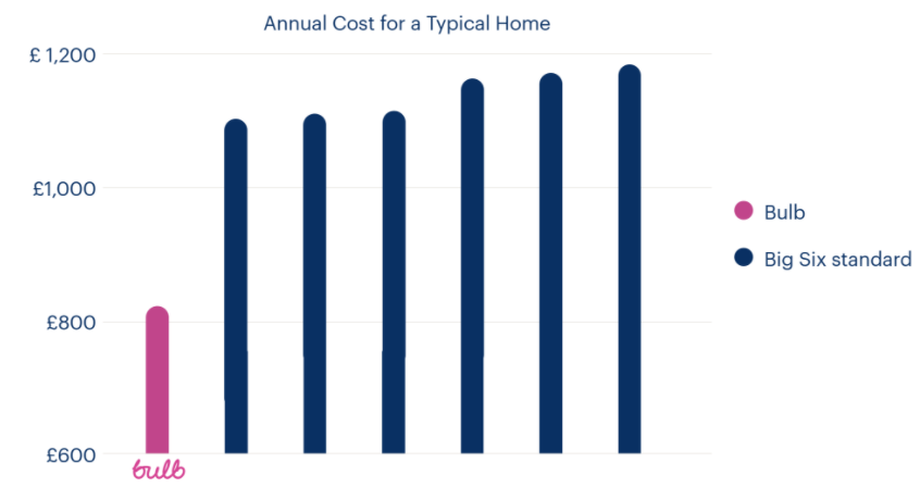
- “Annual Cost For A Typical Home” chart

4. My information page
- URL
- https://join.bulb.co.uk/join/quick-signup
- Included
-
- Heading structure
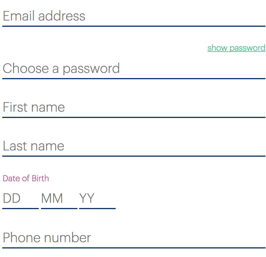
- Form and form error mechanism
- “Show/hide password” mechanism
- Right sidebar
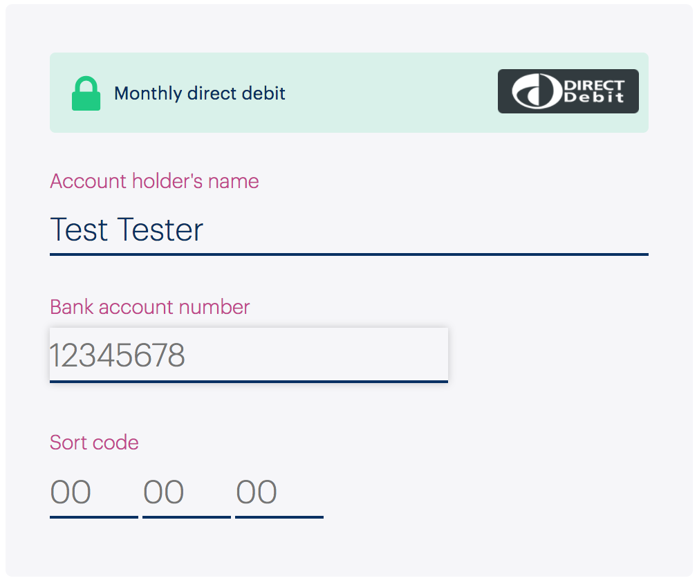
5. My payment details page
- URL
- https://join.bulb.co.uk/join/quick-signup (note that this is the same URL as the 4. My information page URL)
- Included
-
- Heading structure
- Form and form error mechanism
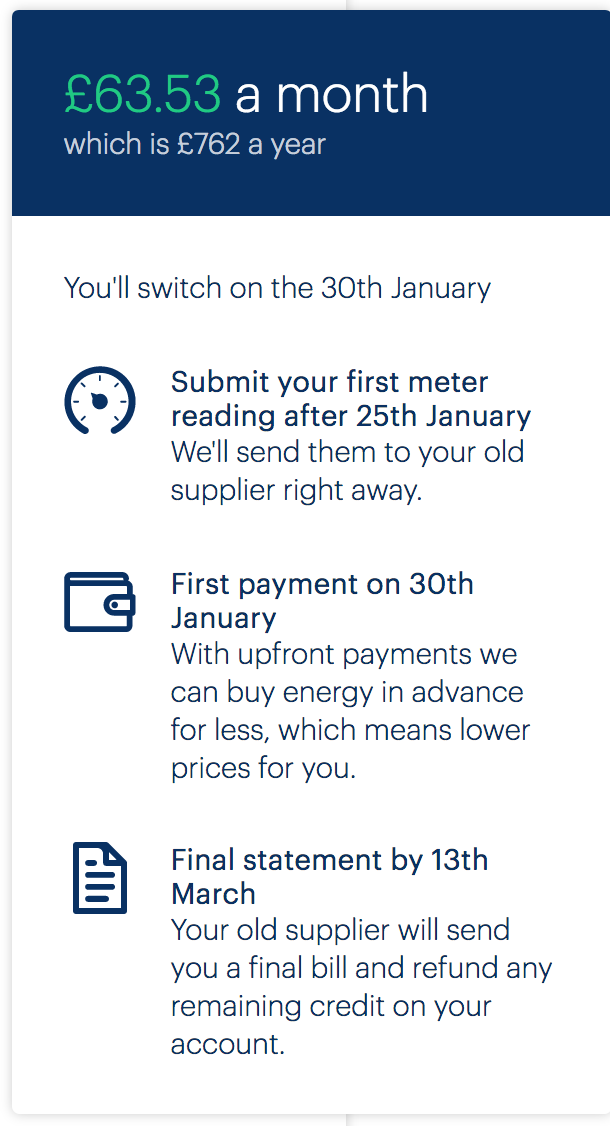
- Right sidebar
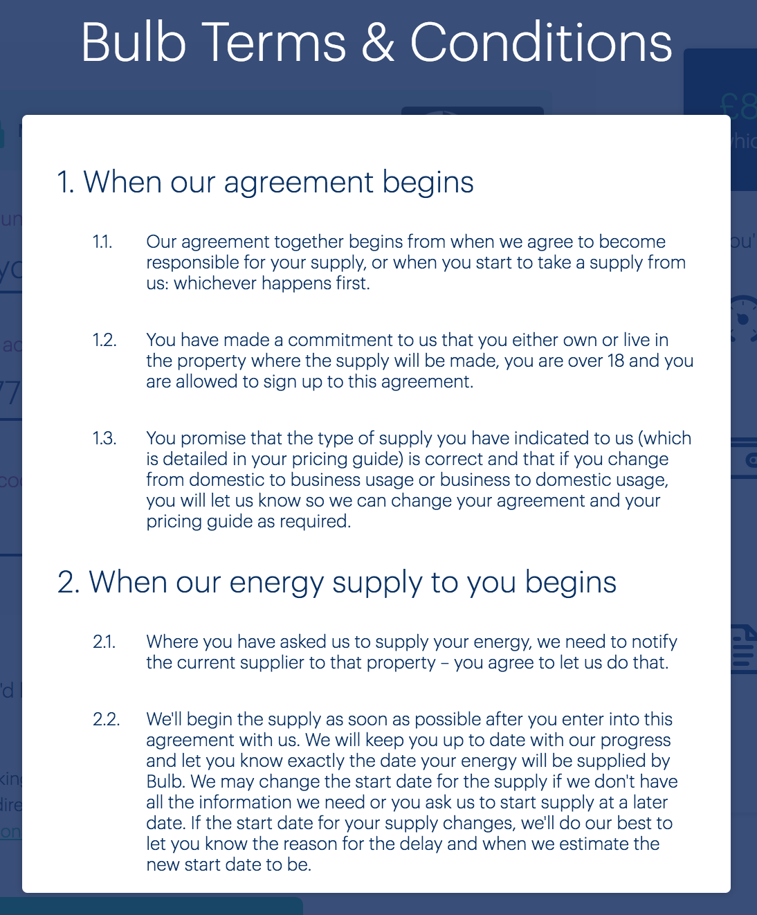
- Terms & conditions dialog window
The account dashboard
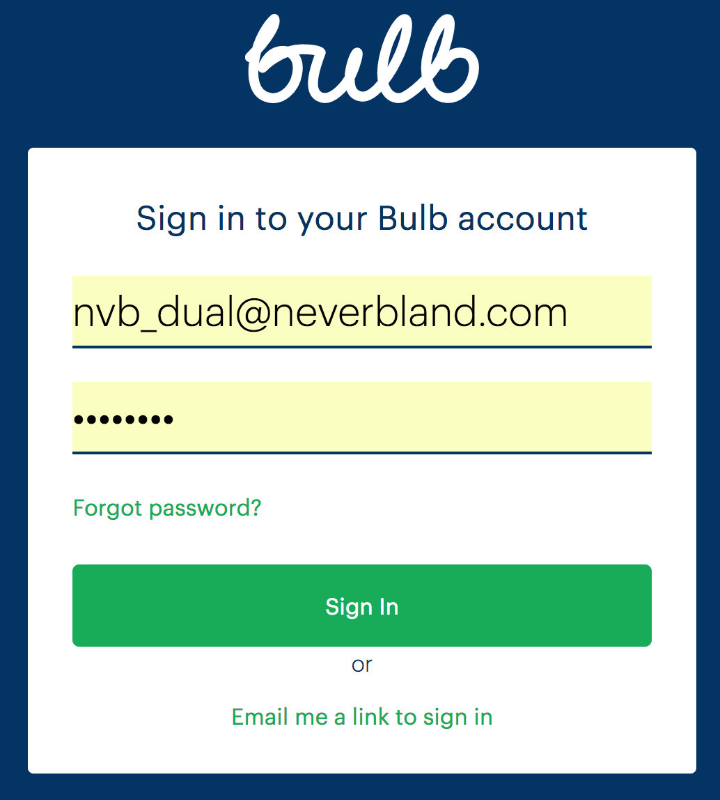
1. Login page
- URL
- https://account.bulb.co.uk/login/password
- Included
-
- Page structure
- Just the password login feature (email link not possible)
- Form and form error mechanism
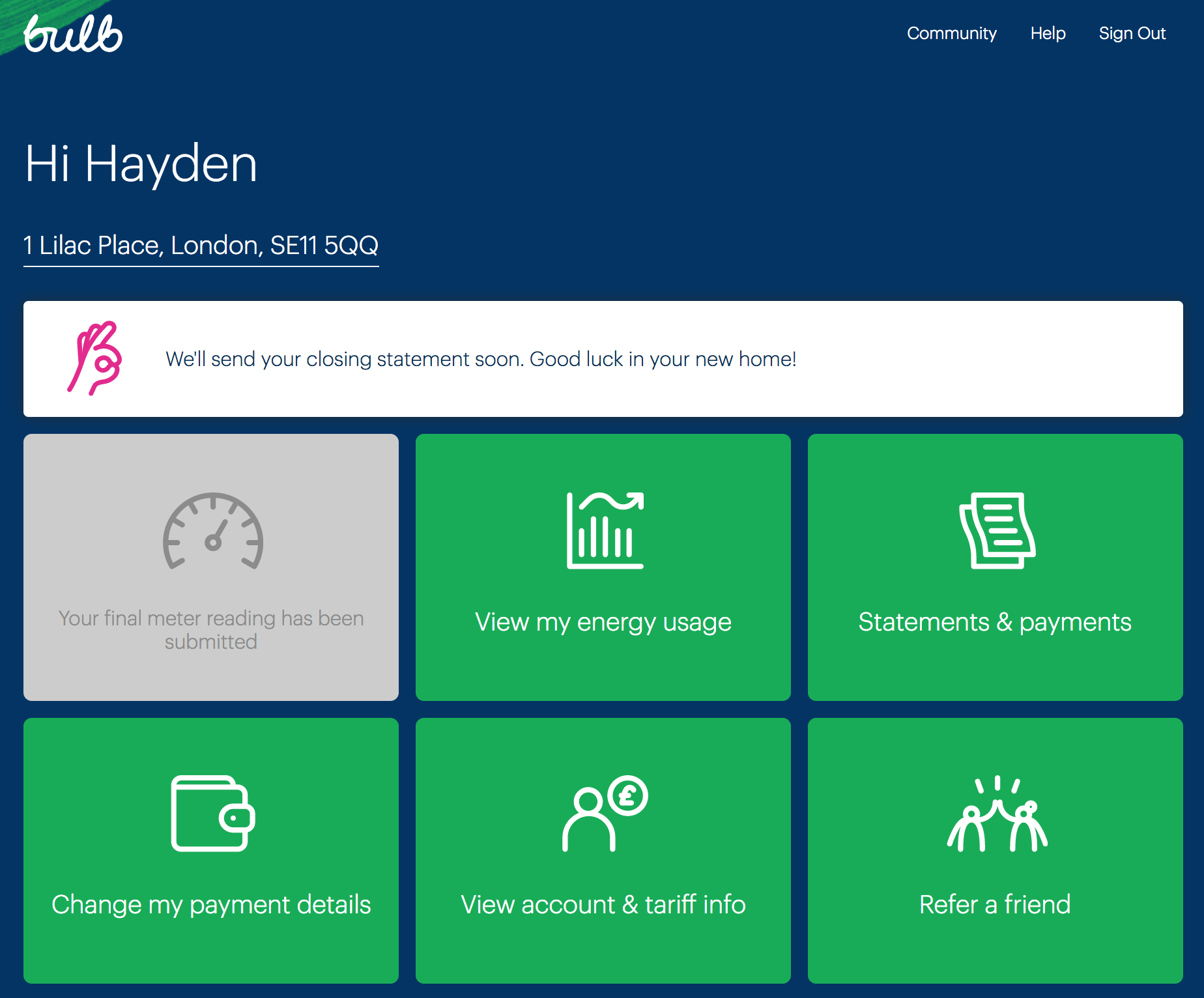
2. Dashboard
- URL
- https://my.staging.bulb.co.uk/dashboard
- Included
-
- Page structure
- Dashboard option grid
- Header/navigation
3. My usage
- URL
- https://my.staging.bulb.co.uk/dashboard/usage
- Included
-
- Heading structure
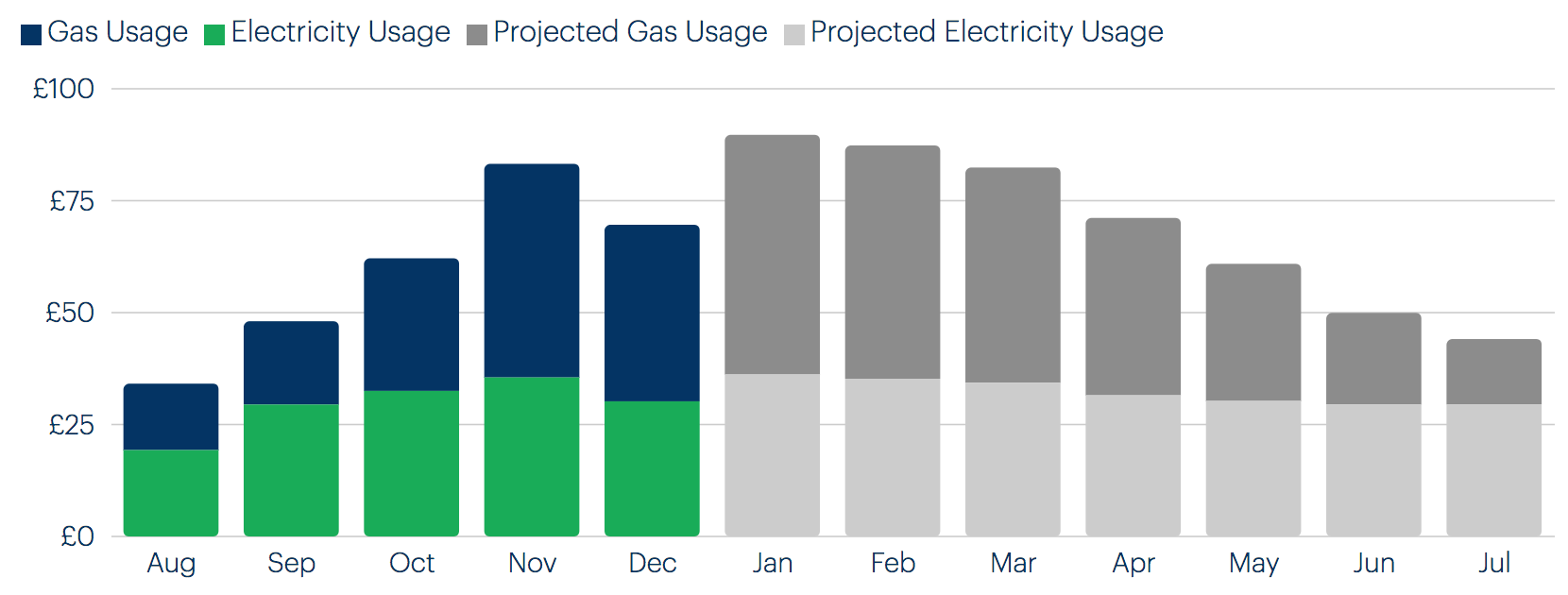
- Usage chart
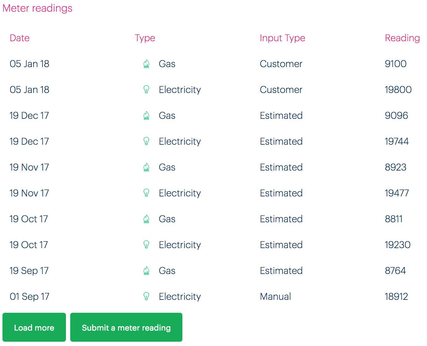
- Usage table
4. Statements and payments
- URL
- https://my.staging.bulb.co.uk/dashboard/statements
- Included
-
- Heading structure
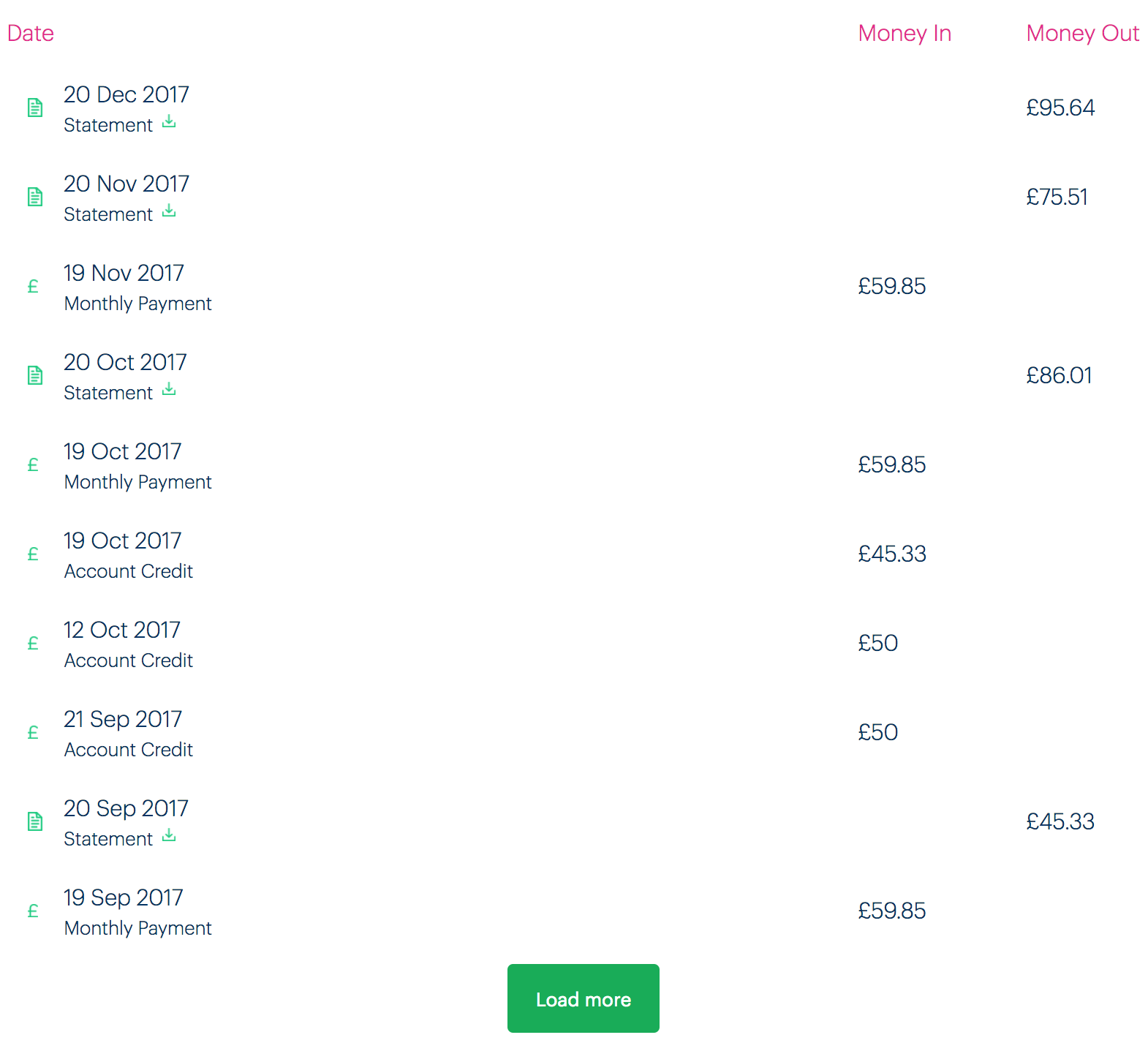
- Payments table
5. Tariff info
- URL
- https://my.staging.bulb.co.uk/dashboard/personal-details
- Included
-
- Page structure
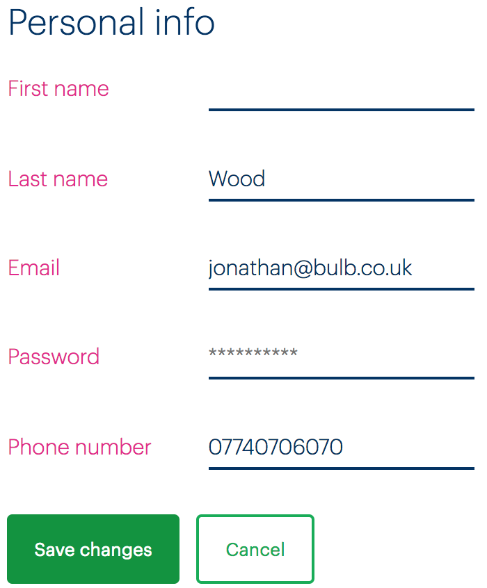
- Personal info form and error mechanism
6. Submit an electricity meter reading
- URL
- https://my.staging.bulb.co.uk/dashboard/meters/give-reading/electricity
- Included
-
- Page structure
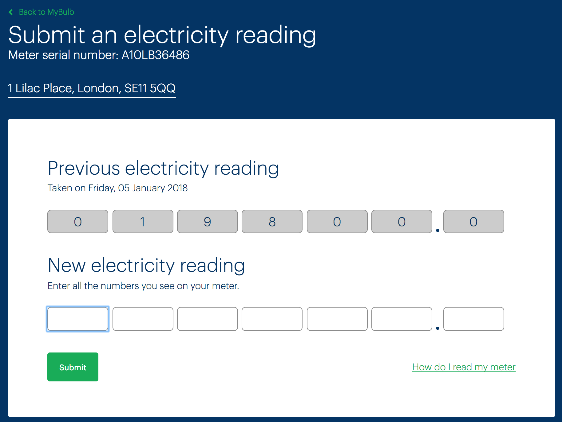
- Previous reading
- New reading form and error mechanism
About navigation
Introduction
The About pages on the marketing site are currently only available via a dropdown submenu (pictured).
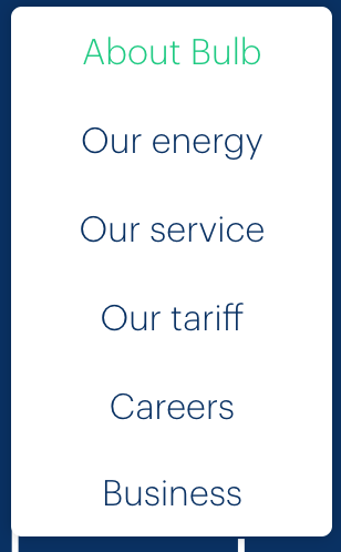
Dropdown submenus are precarious interaction design patterns, prone to accessibility issues. In the case of Bulb’s implementation (which is already keyboard accessible), there are just a few problems:
- The link that activates the menu does not communicate state (expanded or collapsed)
- The menu obscures the activating link/control (see point 6 here)
- The menu does not close when focus is moved from its last item to the adjacent (“Blog”) link.
- The nested list is not identified as a submenu which, though not crucial, would be helpful
It is recommended that dropdown menus are supplemented (or even replaced) by navigation regions placed in the body of each child page. These should contain the same navigation options but do not necessitate being disclosed on click.
- Offer choice : Consider providing different ways for people to complete tasks, especially those that are complex or non standard.
WCAG criteria
- 2.4.3 Focus Order (level A)
- 4.1.2 Name, Role, Value (level A)
Scope of the issue
The Marketing site is currently the only site that offers the About content, but see Inconsistency where a more consistent navigation schema is recommended.
Fixing the issue
It is recommended the enhancements to the dropdown menu noted in the introduction are provided, as well as providing in-page navigation menus for each About child page.
Dropdown enhancements
- Give the top-level “About Bulb” link
role="button"(since it no longer functions as a link). - Include
aria-expandedon the top level “About Bulb” link and toggle betweenfalse(dropdown menu not showing) andtrue(dropdown menu showing). - Move the dropdown lower so as to not obscure the top-level link/control (see the illustration below).
- Add
aria-label="submenu"to the dropdown’s<ul>. - Close the menu when the last item is unfocused in a forwards direction. See the pseudo-code below.
const lastItem = menu.querySelector('li:last-child a')

lastItem.addEventListener('keydown', e => {
  if (!e.shiftKey && e.keyCode === 9) {
    e.preventDefault()
    menu.hidden = true
  }
})
- Assuming the menu container is defined as
menu, we can usequerySelectorto get the last item’s link - We only close the menu if the user presses Tab without Shift (Shift + Tab focuses the previous interactive element — the penultimate item in the submenu, in this case)
- The menu is hidden via the
hiddenproperty.
In-page navigation
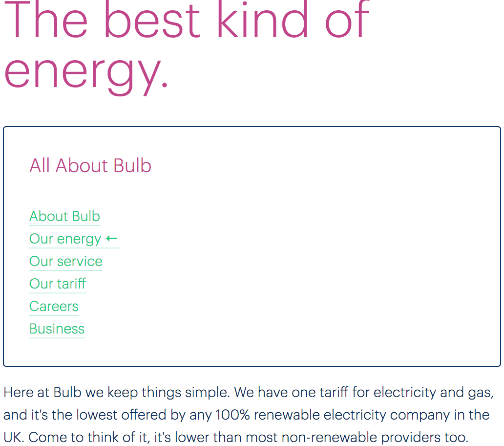
Each page, including the generic About Bulb page found as the first option within the dropdown menu, should include a navigation region within the page and including the same options to other About pages as the dropdown menu offers. This should be placed below the page’s main <h1> heading and include an <h2> heading of “All About Bulb” (or something similarly descriptive). See the markup template below for more details:
<nav aria-labelledby="in-page-nav-title">
  <h2 id="in-page-nav-title">All About Bulb</h2>
  <ul>
    <li class="dd-item"><a href="/about">About Bulb</a></li>
    <li class="dd-item"><a href="/energy" aria-current="page">Our energy</a></li>
    <li class="dd-item"><a href="/service">Our service</a></li>
    <li class="dd-item"><a href="/tariff">Our tariff</a></li>
    <li class="dd-item"><a href="/careers">Careers</a></li>
    <li class="dd-item"><a href="/business">Business</a></li>
  </ul>
</nav>
- The navigation region is labeled by the…
- …
<h2>’sid. This means that entering the navigation region by Tab and focusing the first item will elicit screen readers to announce “navigation, about bulb, list, 6 items, About Bulb, link” (or similar, depending on the screen reader software) - The
aria-currentproperty is an accessible way to indicate the current page/selected option (in this case, we are on the Our energy page). It will elicit “current” as part of the link information readout.
The below is an illustration of how this in-page navigation might look, including a simple style to indicate the current page via [aria-current]:
Answer choices
Introduction
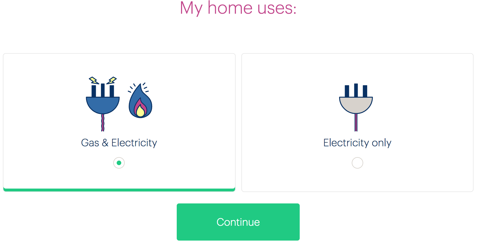
The Join site’s question screens include custom radio button-like components for selecting an answer. For example, the “My home uses” page offers a choice between “Gas & Electricity” and “Electricity only” (pictured).
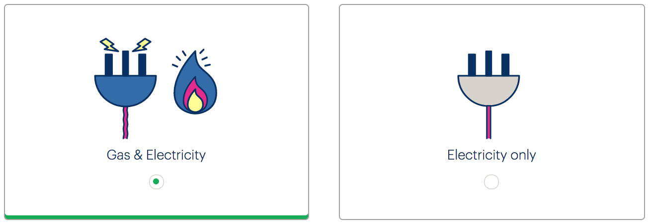
Despite having the appearance of radio buttons (the familiar encircled dot design is used), these are custom components, built in Angular from <div> and <span> elements. A number of issues emerge:
- The controls do not offer any semantic information (role, state etc.) to be consumed by assistive technologies
- The controls are not keyboard accessible (they cannot be focused or activated)
- The controls are inefficiently designed and dependent on CSS
WCAG criteria
- 2.1.1 Keyboard (level A)
- 2.4.7 Focus Visible (level AA)
- 4.1.2 Name, Role, Value (level A)
Scope of the issue
These controls only appear on the Join site:
- https://join.bulb.co.uk/join/questions/my-energy
- https://join.bulb.co.uk/join/questions/my-home
- https://join.bulb.co.uk/join/questions/my-bedrooms
Fixing the issue
There is no reason why these controls should depart with standard radio button (<input type="radio" />) markup. With the help of some CSS, it is possible to create a simplified solution which communicates role and state, and is keyboard operable.
I wrote about this in Replacing Radio Buttons Without Replacing Radio Buttons. A demo that approximates the current design but using true radio buttons is provided below. Note that the arrow keys switch between selected radio button, and the Tab key focuses the selected radio button, as standard.
HTML
<fieldset>
  <legend><h1>My home uses</h1></legend>
  <div class="radios">
    <div class="radio">
      <input type="radio" name="energy" id="gas-and-elec" checked />
      <label for="gas-and-elec">
        Gas & Electricity
      </label>
    </div>
    <div class="radio">
      <input type="radio" name="energy" id="elec" />
      <label for="elec">
        Electricity only
      </label>
    </div>
  </div>
</fieldset>
</form>
- The page’s heading should be an
<h1>, not an<h2>. It is used to form the<legend>. - The radio must be associated to the…
- …label using
forandid - The input must come directly before the label in the markup for the CSS adjacent sibling combinator to work (see below)
CSS
(Only the key CSS is included here.)
[type="radio"] {
  position: absolute;
  white-space: nowrap;
  height: 1px;
  width: 1px;
  overflow: hidden;
  clip-path: inset(100%);
  clip: rect(1px, 1px, 1px, 1px);
}

label {
  display: block;
  padding: 2rem;
  border: 1px solid #666;
  border-radius: 0.5rem;
  margin: 0.5rem;
  cursor: pointer;
}

label::after {
  content: '';
  display: block;
  margin: 0.25rem auto 0;
  width: 1rem;
  height: 1rem;
  border: 1px solid;
  border-radius: 50%;
}

[type="radio"]:checked + label {
  border-bottom: 0.25rem solid #19ac58;
}

[type="radio"]:checked + label::after {
  background-color: #19ac58;
  box-shadow: inset 0 0 0 0.25rem #fff;
}

[type="radio"]:focus + label {
  box-shadow: 0 0 0 0.125rem #ca488d;
}
- The radio button is hidden from view using an accessible technique (this is moved to a
classin Missing and placeholder labels) - The
pointercursor indicates to mouse users that the whole box can be clicked, avoiding potential cognition issues - A proxy radio button design is included using pseudo-content
- Clear
checked… - …and
focusstyling is provided. See Focus styles
Bedrooms stepper
Introduction
The Join Site provides a “stepper” component for incrementing and decrementing the number of bedrooms the user’s house or flat contains (pictured).
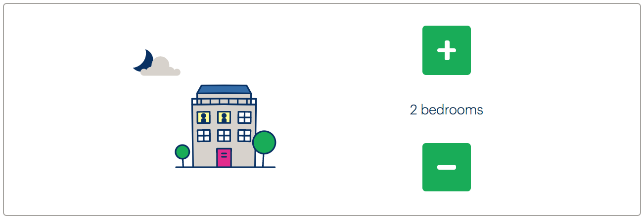
There are a number of issues relating to this implementation:
- The plus and minus buttons do not have focus styles
- The plus and minus buttons do not have labels
- The purpose of the controls is not reported to screen readers
- The updating of the number of bedrooms is not reported to screen readers
It is also unintuitive that the values ‘cycle’. That is, if I’m on “5+ bedrooms” and I try to add another bedroom, the value cycles back to “1”. This is likely to cause confusion since it means each button does the opposite of what its label claims, under certain conditions.
WCAG criteria
- 2.4.7 Focus Visible (level AA)
- 3.3.2 Labels or Instructions (level A)
- 4.1.2 Name, Role, Value (level A)
Scope of the issue
Only the Join Site is affected, at https://join.bulb.co.uk/join/questions/my-bedrooms.
Fixing the issue
The component needs to be restructured as a fieldset with a legend, as in Answer choices. The other provisions are included in the below code example, with notes to follow.
<form>
  <fieldset>
    <legend><h1>The number of bedrooms I have is</h1></legend>
    <button type="button" aria-label="add a bedroom" aria-describedby="current" id="add"></button>
    <div role="status" id="current">
      2 bedrooms
      <span class="visually-hidden">currently chosen</span>
    </div>
    <button type="button" aria-label="remove a bedroom" aria-describedby="current" id="remove"></button>
  </fieldset>
  <button type="submit">Continue</button>
</form>
- The page’s
<h1>forms the legend/group label for the button controls. The wording of the<h1>has been changed in accordance with Wording. - Screen reader-accessible labels are provided via
aria-label. - The buttons are each described by the
#currentelement, so when they are focused the screen reader user is made aware of the current number of bedrooms chosen. - The
#currentelement is also an ARIA live region, meaning that changes to its text are announced as feedback in screen readers. See Form errors for more on live regions. - To make the description more clear non-visually, some visually hidden text is provided to clarify. The special
.visually-hiddenclass is set out in Form errors. - Each button has
type="button". This prevents browsers from seeing the buttons as submit buttons and using them to submit the form.
Demo
The following is provided for testing in screen readers. The styling is not intended to match in this case. To test the demo in VoiceOver, press CMD + F5 and use the Tab and Enter keys to operate the component controls
Collapsible sections
Introduction
Collapsible sections are one of the simpler interaction design primitives. All they do is toggle the appearance of the flow content they introduce. The advantage of having collapsed section in the first place is that the user is afforded an overview of the page structure without necessitating scrolling through large quantities of content.
Despite the simplicity, there are a number of provisions to ensure collapsible sections are accessible:
- The toggle button must behave as a
<button>and have the button role (either implicitly, from the element, or viarole="button") - The button must not override the heading semantics; typically, it is provided as a child of the section’s main heading.
- The toggle button must toggle the
aria-expandedstate betweentrue(expanded) andfalse(collapsed) - The content in its collapsed state must not be available to screen readers and interactive content within it must not be focusable (
display: noneor thehiddenproperty takes care of both of these)
WCAG criteria
- 1.3.1 Info and Relationships (level A)
- 4.1.2 Name, Role, Value (level A)
Scope of the issue
Of the samples in the Scope, only the Marketing site’s About → Careers page appears to be affected. However, collapsibles are a common interaction primitive and the advice to follow should be (broadly speaking) incorporated for any similar pattern.

Fixing the issue
HTML
The following represents the HTML expected in the collapsible section’s collapsed state.
<li class="collapsible">
  <h3>
    <button aria-expanded="false">
      <span>Graduate Energy Specialist</span>
      <svg xmlns="http://www.w3.org/2000/svg" viewBox="0 0 10 10" focusable="false">
        <path fill="currentColor" d="m1 3 4 5 4-5z"/>
      </svg>
    </button>
  </h3>
  <div class="section-content" hidden>
    <!-- section content -->
  </div>
</li>
In the expanded state, aria-expanded is switched to true and the hidden property is removed:
<li class="collapsible">
  <h3>
    <button aria-expanded="true">
      <span>Graduate Energy Specialist</span>
      <svg xmlns="http://www.w3.org/2000/svg" viewBox="0 0 10 10">
        <path fill="currentColor" d="m1 3 4 5 4-5z"/>
      </svg>
    </button>
  </h3>
  <div class="section-content">
    <!-- section content -->
  </div>
</li>
Demo
The following demo uses a simple bit of vanilla JavaScript, in ES5. It is believed that this would be most efficient on a static information site such as the Marketing site. It can, however, be converted as desired.
Dialogs
Introduction
Dialogs typically serve one of two purposes:
- To give the user a choice at a critical juncture
- To alert the user to important information without (entirely) changing their context
Custom dialogs are common, and commonly marked up inaccessibly. For a maximal number of users to be able to perceive and operate dialogs, the following must be catered for:
- The dialog must have the
dialogoralertdialogrole (on its container). - The
role="dialog"/role="alertdialog"element must have a label, usually provided by the dialog’s heading viaaria-labelledby. - Focus must be moved inside the dialog when it is opened.
- Focus must be moved back to the element that invoked the dialog when it is closed.
- The close button has an accessible label in addition to its “✖️” symbol
- The dialog’s content/message can form the
role="dialog"element’s description, usingaria-describedby. A basic template is provided below.
<div role="dialog" aria-labelledby="dialog-title" aria-describedby="dialog-content">
  <h2 id="dialog-title">Dialog title</h2>
  <div id="dialog-content" role="document">
    <p>The body of the dialog / its message</p>
  </div>
  <button aria-label="close">x</button>
</div>
WCAG criteria
- 2.1.1 Keyboard (level A)
- 2.4.3 Focus Order (level A)
- 2.4.7 Focus Visible (level AA)
- 4.1.2 Name, Role, Value (level A)
Scope of the issue
Join site
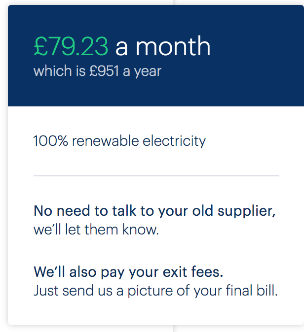
- “Switch now” page (✖️ The “See tariff details” link/button invokes a dialog that has no semantic information and cannot be closed using the keyboard.)
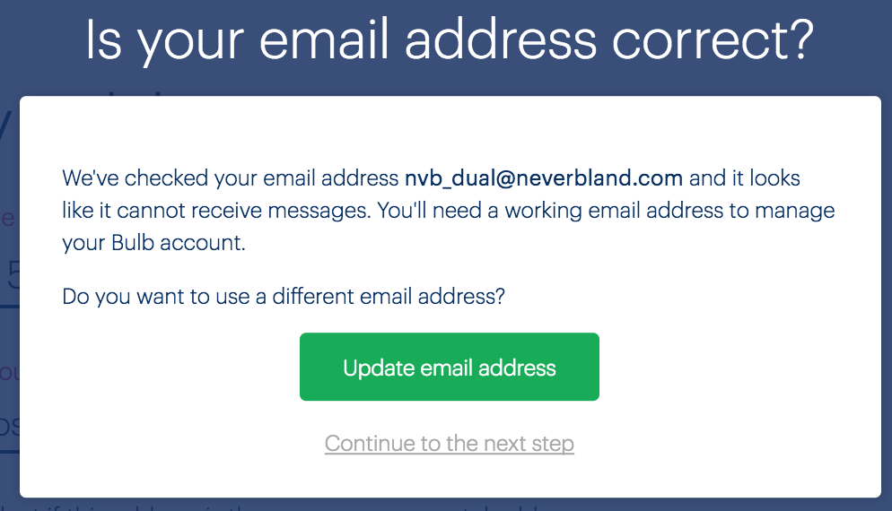
- My information page (✖️ The “Is your email address correct” dialog omits necessary semantic information and does not have focus sent to it when opened.)
Fixing the issue
It is recommended that a drop-in component for dialogs is used across the sites. The A11y Dialog by Hugo Giraudel is a good example, and has no dependencies, so should be relatively easy to port between sites.
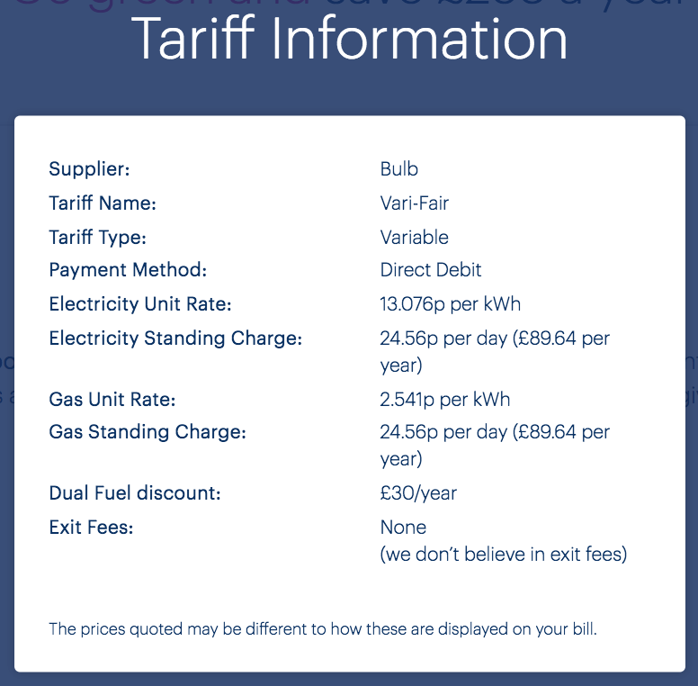
For purely informational dialogs, like the tariff information dialog (pictured) a close button must be supplied and focused when the dialog is opened.
Menu buttons
Introduction
A mainstay in responsive design, the “hamburger” menu button secretes a menu of navigation options that can be revealed on click, press, or — more likely — tap. There is some concern over the usability of hamburger menus meaning they should only be employed where absolutely necessary. If only a few navigation items are provided, simply rearranging them for small screens is probably preferable.

Where menu buttons are included, they need to conform to accessibility standards like any other control. Be aware that not all users of small screens are operating by touch. Keyboard accessibility is still important.
In the case of the Bulb menu buttons (found in both the Marketing site and Account dashboard), there are multiple problems. These are detailed in the Scope of the issue section to follow.
WCAG criteria
- 1.3.1 Info and Relationships (level A)
- 2.1.1 Keyboard (level A)
- 2.4.3 Focus Order (level A)
- 2.4.7 Focus Visible (level AA)
- 3.3.2 Labels or Instructions (level A)
- 4.1.2 Name, Role, Value (level A)
Scope of the issue
Marketing site
- The menu button has no label; it is simply announced as “button” in screen readers.
- The menu button does not include
aria-haspopup, telling the assistive technology user that the menu is a popup menu. - Focus is not moved to the menu upon opening it, meaning its presence is not announced.
- Focus is not trapped within the popup menu while it is open, meaning users can focus hidden content on the page
- The menu’s close button has no label either
Account dashboard
The problems are much the same as the version on the Marketing site, with the following additional issues:
- The menu button uses the incorrect element/role (
<a>/ link) - The close button inside the menu uses the incorrect element/role (
<a>/ link) - Neither the menu button or close button include an
href, making them unfocusable by keyboard
Fixing the issue
Neither of the two implementations conform to a standard (WAI-ARIA) pattern. They are, functionally, a hybrid between an ARIA menu button / menu, a dialog, and a basic collapsible region. Therefore, a custom solution is in order. It is recommended the same solution / markup is used for both the Marketing site and Account dashboard.
HTML
To begin, a basic HTML template is provided below, with notes to follow.
<button aria-label="navigation menu" aria-haspopup="true">☰</button>
<div hidden>
  <ul role="menu">
    <li><a href="[url]">[link text]</a></li>
    <li><a href="[url]">[link text]</a></li>
    <li><a href="[url]">[link text]</a></li>
  </ul>
  <button aria-label="close menu">✖️</button>
</div>
- The menu button and close button are labeled with
aria-label. - The
aria-haspopupproperty tells screen reader users that the button will move focus into a popup when clicked. - The
role="menu"attribute on the list, announces the list as a menu in assistive software. The items are enumerated, just as when using a standard<ul>. - The close button comes after the menu in the source order.
Behavior
The behavior of the menu is paramount, with focus being carefully managed. Here are the steps you need to follow:
- When the user clicks the menu button, focus is moved to the first link element within the menu.
- When the user unfocuses the close button, focus moves back to the first menu item, trapping focus within the menu until the user closes it.
- When the user clicks the close button or presses the ESC key, the menu is hidden and focus is returned to the menu button. It is important the user is returned to their starting point, before the menu was activated.
Below is a codePen demo which implements this markup and behavior. The JavaScript is written in vanilla ES6 and is commented. It will need to be converted into a React component for the Account dashboard.
My Usage chart
Introduction
The Bulb sites use a number of charts and graphs, primarily to illustrate fairly simple concepts. However, the energy usage chart found in the Account dashboard’s My usage screen communicates critical, detailed information. It — or an alternative for it — therefore needs to communicate the information it represents in a detailed and structured way.
Commonly, complex charts are accompanied by invisible data tables, intended for blind screen reader users. This is a mistake, because not only blind users benefit from a tabular representation of the data. Instead, we should offer a choice between a chart and table view of the data and controls to switch between these views.
-
Offer choice
:
Consider providing different ways for people to complete tasks, especially those that are complex or non standard.
There is often more than one way to complete a task. You cannot assume what someone's preferred way might be. By providing alternatives for layout and task completion, you offer people choices that suit them and their circumstances at the time.
WCAG criteria
- 1.1.1 Non-text Content (level A)
- 1.3.1 Info and Relationships (level A)
- 1.3.3 Sensory Characteristics (level A)
Scope of the issue
The usage chart is found on the Account dashboard’s My usage screen.
Fixing the issue
A set of radio button controls should be provided to switch between chart and table views. With the data table option available, only a terse text alternative for the chart is necessary. The highlighted code is what I have added.
The chart with text alternative
<svg class="recharts-surface" role="img" aria-label="Bar chart showing electricity and gas usage over a 12 month period." focusable="false" width="819" height="303.3333333333333" viewBox="0 0 819 303.3333333333333" version="1.1">
  <!-- SVG chart content -->
</svg>
The data table
(The example code just shows rows for August - October)
<table>
  <tr>
    <td></td>
    <th scope="col">Electricity</th>
    <th scope="col">Gas</th>
    <th scope="col">Total</th>
  </tr>
  <tr>
    <th scope="row">August</th>
    <td>£19</td>
    <td>£15</td>
    <td>£34</td>
  </tr>
  <tr>
    <th scope="row">September</th>
    <td>£29</td>
    <td>£19</td>
    <td>£48</td>
  </tr>
  <tr>
    <th scope="row">October</th>
    <td>£33</td>
    <td>£30</td>
    <td>£62</td>
  </tr>
</table>
- Each table header must be a
<th>element. - Column table headers need their direction explicitly set using
scope="col". - Row table headers need their direction explicitly set using
scope="row". - The data table should use full — rather than abbreviated — labels: “August” in place of “Aug”.
Demo
| Electricity | Gas | Total | |
|---|---|---|---|
| August | £19 | £15 | £34 |
| September | £29 | £19 | £48 |
| October | £33 | £30 | £62 |
The radio buttons
The radio buttons for choosing between the two panels, chart and table, can use standard <input> markup. No group label is necessary, since the purpose of the controls can be inferred from the context. Styling such controls is covered in detail in Answer choices. Below is a demo.
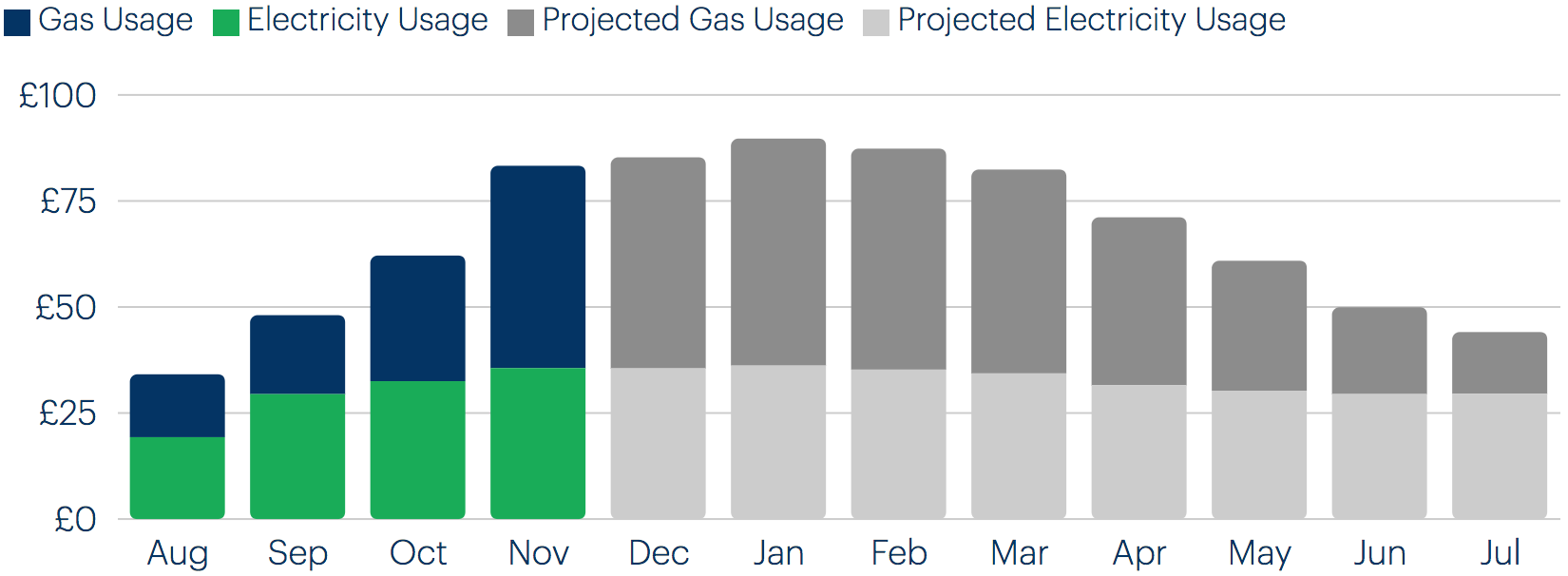
| Electricity | Gas | Total | |
|---|---|---|---|
| August | £19 | £15 | £34 |
| September | £29 | £19 | £48 |
| October | £33 | £30 | £62 |
Show password
Introduction
The option to “show password” when one is writing it is a sound inclusive design feature, helping users to compose or check their writing of passwords. However, a “show password” button that is not technically accessible fails some of the users who may want to take advantage of it.

The pictured show password control ahs a number of problems that need addressing:
- It functions as a button, but is marked up as a link
- It is not focusable by keyboard (because, as a link, it is missing an
href) - Were it focusable, upon clicking it, focus would be lost — because it is actually two controls, with one always hidden
- It appears before the field to which it relates, which is somewhat confusing visually and represents a backwards reading order non-visually.
WCAG criteria
- 1.3.2 Meaningful Sequence (level A)
- 2.1.1 Keyboard (level A)
- 4.1.2 Name, Role, Value (level A)
Scope of the issue
Fixing the issue
Fundamentally, a toggle control should not use link semantics, or be styled as a link. Links are expected to perform linking/navigation behavior. Instead, supply the control as a checkbox, which communicates state (checked/on and unchecked/off) implicitly. This removes the necessity of managing two controls, and solves the dropped focus problem.
In the demo provided below, the checkbox is above the form field and a persistently visible label is provided above the input — see Missing and placeholder labels.
Color dependence
Introduction
Color makes interfaces attractive and can sometimes help to reinforce meaning. For example, red is associated with danger in many Western cultures, and may form part of a ‘delete’ button’s design.
But dependence on color alone to communicate important information runs the risk of alienating a range of users, including those with forms of color blindness, and others with monochrome displays.
In each case color is used to differentiate items, a supplementary alternative method of differentiation should also be present. The convention of underlining inline links, for example, is considered robust. For keys that differentiate bars in bar charts or segments in pie charts by color, embedded patterns can assist comprehension.
WCAG criteria
- 1.4.1 Use of Color (level A)
Scope of the issue
Inline links
The Join site “Switch now” page “Have your bill handy? Refine your quote” text:

The Account dashboard Dashboard “Need help?” text:

Chart keys
Some charts included depend on color alone for differentiating bars.
- “Switch now” page (Join site)
- My usage (Account dashboard)
Form errors
Form errors are presented differently around the three sites (see Inconsistency). But, in some cases, only color is used to differentiate the error. For example: the Join site Welcome page (pictured).

Full list of affected URLs:
- Welcome page (Join site)
- My information page (Join site)
Elsewhere, “✖️” symbols are used to mark errors, so there is no problem.
Fixing the issue
Inline links
By virtue of convention, users expect links to have underlines of some form. Whether these are provided using text-decoration, border, or a linear gradient is another question. The most readable method for the font’s metrics is the soundest choice.
One thing that can improve readability for text-decoration in supporting browsers is the use of text-decoration-skip, which stops the underline intersecting descenders of the font.
a {
  text-decoration: underline;
  text-decoration-skip: ink;
}
Here is a demo (you should see the effect in Chrome, Opera, and Safari if you use the -webkit- prefix):
Chart keys
It is recommended that linear-gradient based patterns are used to help differentiate the different bars and bar parts. Following is a demo of some gradient options for the My usage page:
- Gas usage
- Electricity usage
- Projected gas usage
- Projected electricity usage
Form errors
Use a method to make the error text stand out, such as prefixing the message with <strong>Error:</strong> or providing a warning icon. Should you opt for an icon, ensure it has an accessible label in the form “Error:“.
<label for="postcode">Your postcode:</label>
<input id="postcode" name="postcode" aria-describedby="postcode-error">
<div id="postcode-error">
  <svg aria-label="Error:" focusable="false">
    <use xmlns:xlink="http://www.w3.org/1999/xlink" xlink:href="/assets/images/icons/forms.svg#error"></use>
  </svg>
  Please enter a valid postcode.
</div>
- The
aria-labelproperty provides the accessible label focusable="false"stops the SVG being focusable in Internet Explorer. This should be applied to all inline SVGs in the Bulb sites.
Elements cannot be focused
Introduction
All interactive elements — buttons, links, form controls — need to be focusable by keyboard. If they cannot be focused they cannot be activated, meaning users who depend on the keyboard for navigation will miss out on functionality.
Common mistakes include using <div> or <span> elements as substitutes for <button>s and links. Or using a link as a button and omitting its href which makes it a ‘placeholder link’ that does not receive focus.
WCAG criteria
- 2.1.1 Keyboard (level A)
- 2.4.3 Focus Order (level A)
Scope of the issue
Join site
There are instances of links being used to trigger JavaScript events, with their href omitted. Critically, the “Switch now” button (found on the “Switch now” page, and pictured below) cannot be focused.

The “See tariff details” control below it suffers the same issue. Here is the code (note the lack of href):
<a ng-click="QuoteResultCtrl.showModal('tariff')" class="quote-result-switch-now-box__link">See tariff details</a>
In addition, the “Continue to the next step” control in the “Is your email address correct?” dialog (pictured) is a <span> with a ng-click handler, meaning it is not focusable and not communicated as an interactive element in assistive technologies.
Fixing the issue
Join site
The “Switch now” button should remain a link, because it navigates the user to a new screen. It is recommended the href provided is the URL of the page to which the JavaScript transports the user. The “See tariff details” control below it should be a <button> since it invokes an in-page dialog screen.
The “Continue to the next step” control in the “Is your email address correct?” dialog should be a link with an href pointing to the “next step”. See Routing for the related issue about different screens in the Join site using the same URL.
Focus styles
Introduction
Focus styling, provided by user agents by default, is used to indicate which element is currently being focused by keyboard. Typically, focus is achieved by pressing the Tab key. Pressing Tab should focus the next interactive element in the source, invoking the focus style.
Users who rely on the keyboard for page navigation include those with motor impairments due to long term ailments (such as rheumatism) or temporary injuries (like a broken wrist). Where focus styles are not provided, it is left for them to guess which element they have under focus, and is therefore ready to be activated. Their experience of using the interface will be confusing and frustrating, and they may give up on trying to achieve some tasks.
WCAG Criteria
- 2.4.7 Focus Visible (level AA)
Scope of the issue
Most of the Marketing site is missing focus styles. The Join site has a mixture of missing focus styles and somewhat inadequate default focus styles, and the Account dashboard relies almost entirely on default user agent styles.
Fixing the issue
Contrary to popular belief, it is possible to provide clear but attractive focus styles without JavaScript and without adversely affecting mouse users. On the Bulb sites, I recommend an animated outline property. Press the Tab key to invoke the focus style on the example link provided:
Code
a, button, input, textarea /* etc */ {
  outline: 0.125em solid transparent;
  outline-offset: 0.5em;
}

:focus {
  outline-color: currentColor;
  outline-offset: 0.125em;
  transition: all 0.25s ease-out;
}

:hover:focus {
  outline: none;
}
- The initial outline is invisible…
- … and has a wide offset.
- On focus, the outline takes the font color. In most cases this will be the correct (visible against the background) color for the context.
- The
outline-offsetis shrunk via a transition, drawing the eye. - (optional) By concatenating
:hoverand:focus, the focus style is partially suppressed for mouse users who may find it distracting.
Form errors
Introduction
As users attempt to complete forms, it is important they are notified promptly and clearly when they make errors, and are provided with assistance in fixing those errors.
For assistive technology users, completing forms can be especially arduous where one or more of the following are true.
- The invalid state of a field is not communicated
- The error message is not associated with the field
- The presence of errors is not communicated on submission
The careful wording of error messages and descriptions is also important, as well as indicating which text is error text without relying entirely on color (see Color dependence).
WCAG criteria
- 3.3.1 Error Identification (level A)
- 3.3.3 Error Suggestion (level AA)
Scope of the issue
Marketing site
- Home page (✖️ The “Get A Quote” form’s error is not associated to the form element and is not announced on form submission.)
- About → Our energy (✖️ The “Get A Quote” form’s error is not associated to the form element and is not announced on form submission. Note that, because the field here uses
required, a browser error message appears if the field is empty.) - About → Business (✖️ Presence of errors not announced on submission; individual errors not associated with their fields; Descriptions not part of field labels.)
Join site
- Welcome page (✖️ The “Get My Quote” form’s error is not associated to the form element and is not announced on form submission.)
- My information page (✖️ Individual errors not associated with their fields; form cannot be submitted until fields are corrected, so the presence of errors is not clear.)
Accounts dashboard
- Login page (✖️ Individual errors not associated with their fields; generic “Wrong email or password” error not announced on attempted submission.)
- Select an electricity meter reading (✖️ The page relies on browser validation, which is inconsistent with the bespoke implementation elsewhere.)
- Tariff info (✖️ See image below — a message is provided to alert users of errors, but not as an accessible live region; the fields that have errors are not indicated at all, let alone accessibly with
aria-invalid="true". Note that the “Okay” button is not necessary for any users. The error can simply disappear when the form successfully submits. Remove this button.)

Fixing the issue
Form error messages must be included consistently and accessibly across the sites.
Individual form errors
The following code example exemplifies a typical form field in its invalid/errored state, with notes to follow:
<label for="name">
  Your name:
  <div class="description">Including your forename and surname</span>
</label>
<input id="name" name="postcode" aria-describedby="name-error" aria-invalid="true">
<div id="name-error">
  <strong>Error:</strong> Please enter a valid post code.
</div>
- If present, a description should be part of the label, so inside the label element (see About → Business where it is currently adjacent).
- The
aria-describedbyattribute associates the input field to the error message element using the shared “name-error” cipher, in this case. - The
aria-invalidproperty sets the state and tells assistive technology users who have focused the field that it is invalid. Note that you must explicitly write="true". Just includingaria-invalid(boolean) is not reliable. - The
idvalue matches thearia-describedbyvalue - To identify the error as an error, use spell it out (or use an icon, as described in Color dependence).
Announcing the presence of errors
You should let users attempt form submission and alert them to errors if they are present.
In the case of forms with multiple fields, a generic message should appear. This is the case on the About → Business page already. However, the message is not announced in screen readers because it does not belong to a live region.
If you are not familiar with live regions, they announce (in screen readers) content as it is added with JavaScript. The basic markup for an alert live region is as follows.
<div role="alert" aria-live="assertive">
  <!-- add anything here to have it announced in screen reader software -->
</div>
Here is a little demo, showing you how your form errors live region would work. If you are using a Macbook, simply press CMD + F5 to activate the Voiceover screen reader, then press “submit” to both reveal and announce the message.
“Get A Quote” / “Get My Quote”
These simple, one input forms do not need a separate announcement for invoked errors. Instead, the individual post code error message can be made a live region.
<label for="postcode">Your postcode:</label>
<input id="postcode" name="postcode" aria-describedby="postcode-error">
<div id="postcode-error" role="alert">
  <svg aria-label="Error:" focusable="false">
    <use xmlns:xlink="http://www.w3.org/1999/xlink" xlink:href="/assets/images/icons/forms.svg#error"></use>
  </svg>
  Please enter a valid post code.
</div>
Suppressing browser validation
Make sure your bespoke error notification system is consistent across the forms and sites, to reduce confusion. Where forms, such as the Select an electricity meter reading form (pictured) include automatic browser validation, suppress it by applying novalidate to the <form> element.
The Marketing site Home page quote form differs from the Join site Welcome page quote form in that browser validation is used for an empty field. Browser validation is not consistent between browsers, so each quote form should use the bespoke/JavaScript validation.
See Inconsistency for more.
Heading structure
Introduction
Heading elements are often chosen according to the perceived importance of the text they contain and the sections they introduce. The more ‘important’ the heading, the higher the heading level and — typically — the larger the font size. An <h3> might be 1.5rem and an <h1> 3rem.
However, headings levels do not simply denote importance, but a hierarchy of page subsections. There are certain rules to creating a hierarchy (or ‘document outline’) that should not be broken:
- Levels should not be skipped. A section introduced by an
<h2>must use<h3>headings to introduce immediate subsections — no matter how ‘important’ you feel those subsections are, in terms of content. - Each page should have a single
<h1>which introduces the unique topic of the page. - Any element that is used visually to denote a heading must use a heading element (
<h1> → <h6>)
Here is an example outline, starting with an <h1> heading and using heading levels to denote a nested section/subsection structure:
- Main heading (
<h1>)- A subheading (
<h2>) - Another subheading (
<h2>)- A nested subheading (
<h3>)
- A nested subheading (
- A final subheading (
<h2>)
- A subheading (
Headings are relied upon by assistive technology users such as screen reader users. They both create a map of the page structure and provide shortcuts to traverse that structure. For example, the JAWS screen reader allows you to skip between headings using the h key, and between specific headings by level using numeric keys (3 for <h3> headings, for example).
WCAG criteria
- 1.3.1 Info and Relationships (level A)
Scope of the issue
Marketing site
- About → Our energy (✖️ An
<h2>for the main heading followed by further<h2>elements) - About → Careers (✖️ Multiple
<h1>elements) - About → Business (✖️ An
<h2>for the main heading followed by further<h2>elements) - Footer (✖️ The footer on each page has headings starting at the
<h3>level, but this is not thematically correct, since the content here does not belong to the<h2>introduced section that typically resides above the footer in the main content.)
Join site
- Welcome page (✖️ An
<h2>subheading used as the main and only heading on the page) - Questions (✖️
<h2>headings are used as the main and only heading of each question page) - “Switch Now” page (✖️ Heading structure, though correctly nested, begins at the
<h2>rather than<h1>level) - My information page (✖️ An
<h2>subheading used as the main and only heading on the page, and the “My address” heading is marked up not as a heading, but a<div>) - My payment details page (✖️ An
<h2>subheading used as the main and only heading on the page)
Account dashboard
- Login page (✖️ There is no
<h1>; “Sign into your Bulb account” acts as the<h1>but is marked up as a<p>.) - Dashboard (✖️ There is a lack of heading structure past the main
<h1>heading, despite a number of subsections — the green boxes — being included) - My usage (✖️ The main
<h1>contains the “Back to Bulb” link, breaking its label; the “Meter readings” heading is an<h4>, when it should be an<h2>) - Tariff info (✖️ The main
<h1>contains the “Back to Bulb” link, breaking its label) - Submit an electricity meter reading (✖️ The main
<h1>contains the “Back to Bulb” link, breaking its label; the previous and new reading headings skip two levels to be<h4>when they must be<h2>)
Fixing the issue
- Each page should have a singular
<h1>heading, at the start of the main content. - Each subsection should take a heading level that reflects its nesting level in the document outline.
- Each element that is used as a heading visually should use the correct heading element (of the appropriate level) to mark it up.
- Make sure only content that forms the heading text is found inside the heading element (place the “Back to Bulb” links outside and above the
<h1>headings to which they currently belong). - The Marketing site footer must either replace the
<h3>headings with<h2>s or provide an introductory<h2>heading to which the<h3>s can belong.
Where you wish to use a smaller font size for a heading (such as for the “Meter readings” heading, pictured) do not choose a different level. Instead, adjust the heading style with a class.
It may help to pair classes and element selectors like so:
h4, .h4 {
  font-size: 1.3rem;
}
You can then apply the (higher specificity) class to the heading and change its appearance without breaking the hierarchy:
<h2 class="h4">Meter readings</h2>
Inconsistency
Introduction
An important inclusive design principle, is “Be consistent”. Interfaces that fail to do so present unnecessary burdens of comprehension to users — especially those who consume HTML semantics, such as screen reader users. In particular, inconsistent navigation schema and page structure can make the user feel disoriented and unsure.
It is appreciated that a consistent experience can be difficult to achieve when managing three separate projects, built on separate technologies, and it is noted that a design system is currently being developed to help diminish the issue.
WCAG criteria
- 3.2.3 Consistent Navigation (level AA)
- 3.2.4 Consistent Identification (level AA)
Scope of the issue
Navigation
The main navigation differs across the three properties. The Marketing site offers a number of options (pictured), the Join site excludes navigation altogether, and the Account dashboard (also pictured) offers just three navigation options: “Community”, “Help”, and “Sign out”.


Note that, while these sites are built and managed separately, users do not necessarily access them separately or consider them autonomous. The severity of this issue of consistency depends on user journeys and behavior.
In general, every landmark region except the <main> (or role="main") region is expected to have consistent content between pages. The <main> region defines the unique content of the page.
Forms
There is a lot of inconsistency between the sites regarding the way form elements, labels, and errors are marked up and presented visually.
Fixing the issue
Navigation
It is recommended that the same (complete) Marketing site navigation is used for each of the three sites, with the exception that “Sign out” is not pertinent except to logged in users of the Account dashboard. The visual design (colors, layout, and font size) should also be consistent.
Forms
See Missing and placeholder labels and Form errors for recommendations on form design and error reporting. Use the same behavior and visual design for labels, placeholders, individual error messages, and generic error notification live regions.
List structure
Introduction
Along with headings, lists give structure to a web page. They group items together so users know they are related or equivalent.
Assistive technology users find lists especially helpful because most software will identify a list semantically, enumerate its items, and provide shortcuts for navigating between the list items. The NVDA screen reader provides the L shortcut key for navigating between lists, and the I shortcut key for jumping between list items.
Where lists are not used appropriately, the structure of content can be unclear and difficult to traverse.
WCAG criteria
- 1.3.1 Info and Relationships (level A)
Scope of the issue
Marketing site
The navigation schema for the marketing site (pictured) does not use list markup. While some assistive technologies will identify the <nav> and enumerate the links within it, this is no substitute for a <ul> and <li>s to wrap each item.

This also applies to the social media navigation region, but does not apply to the Account dashboard navigation.

That the navigation is constructed differently across the sites represents an issue of inconsistency. Note the “Be consistent” inclusive design principle:
-
Be consistent
:
Use familiar conventions and apply them consistently.
Familiar interfaces borrow from well-established patterns. These should be used consistently within the interface to reinforce their meaning and purpose. This should be applied to functionality, behavior, editorial, and presentation. You should say the same things in the same way and users should be able to do the same things in the same way.
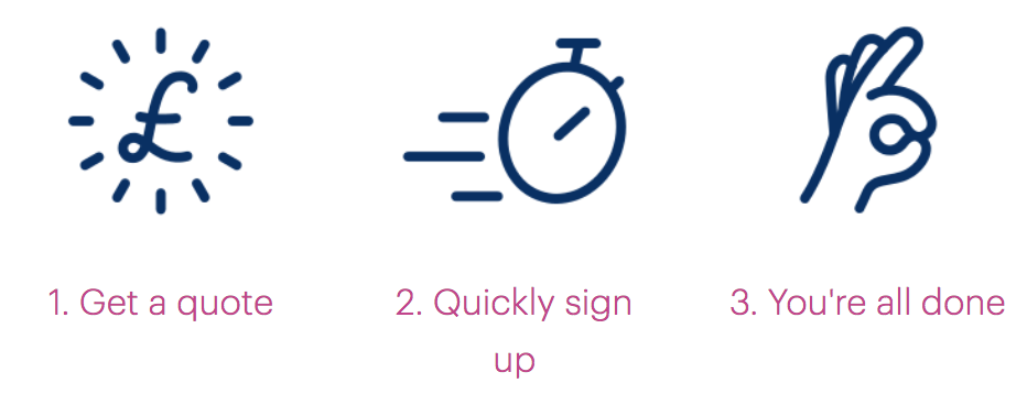
In addition, the “1, 2, 3 Switch” section (pictured) features a list of illustrated steps, but they are marked up as plain text within <div> elements.
Join site
As in the “1, 2, 3 Switch” section, the Join site’s Welcome page includes a set of features/benefits not formed as a list (pictured).

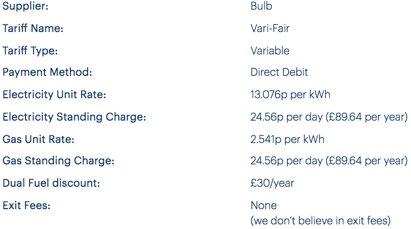
The “Tariff info” dialog includes what looks like a definition list, but each row is a <ul> and the keys/values separate <li> elements, meaning there are twice as many ‘items’ as there should be.
Account dashboard
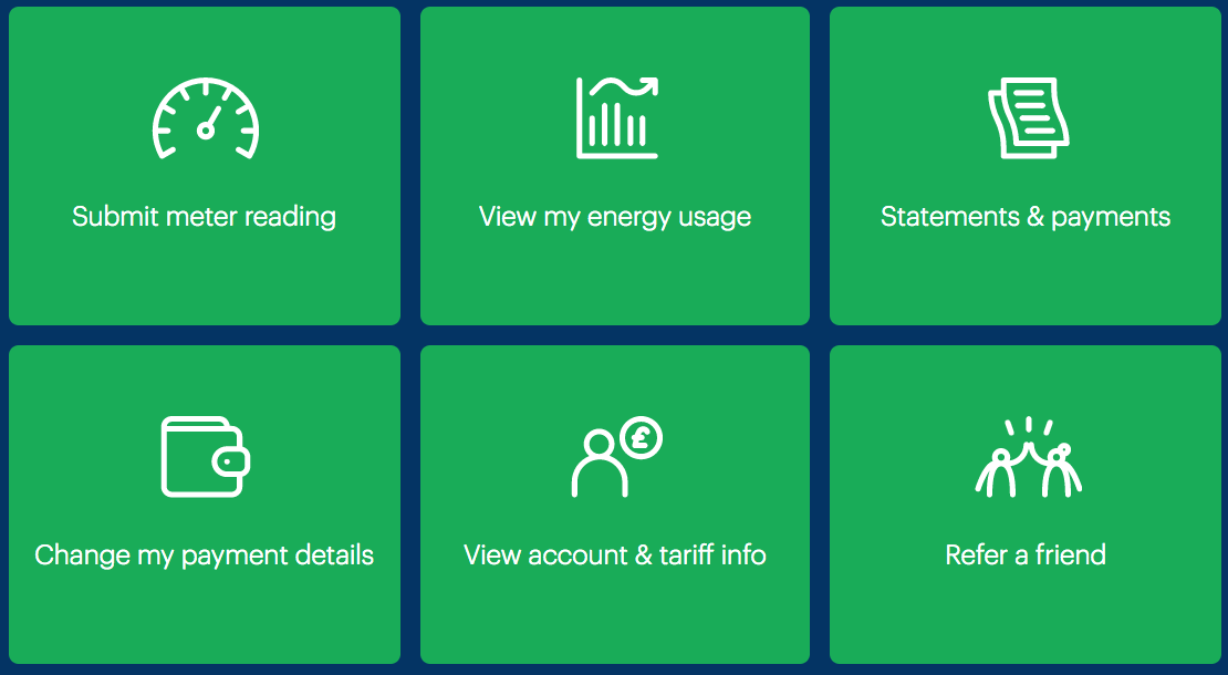
On the Dashboard page, a grid of green boxes are presented as account management options (pictured). Although they are equivalent choices, they are not marked up as a list of options (inert <div> markup is used instead).
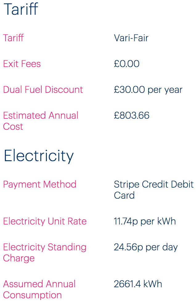
On the Tariff info page, ‘layout tables’ are used to place keys and their values side by side (pictured).
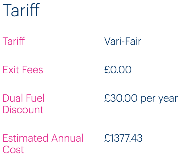
This is an incorrect use of <table> semantics, and should instead be marked up as a definition list (using <dl>).
Fixing the issue
Navigation region lists
- Ensure all instances of
<nav>regions use list markup. - In the case of the Account dashboard grid, make it a
<nav>and use a combination of list markup and headings to give a clear, easily navigable structure. For extra credit, differentiate different<nav>regions with labels. See the code example and notes to follow.
(Dashboard example; code is simplified and elided)
<nav aria-labelledby="manage-heading">
  <h2 id="manage-heading">Manage your account</h2>
  <ul>
    <li>
      <h3><a href="[url]">Submit reading</a></h3>
    </li>
    <li>
      <h3><a href="[url]">View my energy usage</a></h3>
    </li>
    <li>
      <h3><a href="[url]">Statements and payments</a></h3>
    </li>
    <!-- other options -->
  </ul>
</nav>
- The navigation region is labeled using the
<h2>heading. On focusing the first link inside the region, assistive technologies will communicate “manage your account, navigation, list, 6 items, Submit your reading, link” or similar. - For this relationship to work, the value of
aria-labelledbyand the value of the<h2>’sidneed to match.
Definition lists
On the Account dashboard Tariff info page, use <dl> markup for each set of keys/values. The “Tariff” example:
<h2>Tariff</h2>
<dl>
  <dt>Tariff</dt>
  <dd>Vari-Fair</dd>
  <dt>Exit Fees</dt>
  <dd>£0.00</dd>
  <dt>Dual Fuel Discount</dt>
  <dd>£30.00 per year</dd>
  <dt>Estimated Annual Cost</dt>
  <dd>£1377.43</dd>
</dl>
Missing and placeholder labels
Introduction
All form elements need labels associated to them. Where a label is not associated, the screen reader user is not informed of the field’s purpose upon focusing that field. Screen reader users typically traverse forms by focus, not ‘virtual cursor’ (element by element).
The placeholder attribute is intended for providing supplemental hints and examples for completing a form. It should be used in conjunction with a standard and persistent label, conventionally placed above the input in question.
Where placeholders are used as primary labels, a number of accessibility and usability issues emerge.
Firstly, the placeholder is not supported as an accessible label in legacy browsers and assistive technologies, meaning those users will not hear a label as they focus the control.
For sighted users, there are cognitive challenges with the intermittent nature of the placeholder label, resulting in some getting confused and frustrated as they try to remember what it was they were supposed to be entering. Others mistake the placeholder text as content and think the field is already complete.
WCAG criteria
- 3.3.2 Labels or Instructions (level A)
Scope of the issue
Marketing site & Join site
Placeholders-as-labels are found wherever there is a “Get A Quote” / “Get My Quote” form.
- Home page
- About → Our energy
- Welcome page (Join site)
In addition, the Join site’s “My Information” form has no visible and persistent labels:
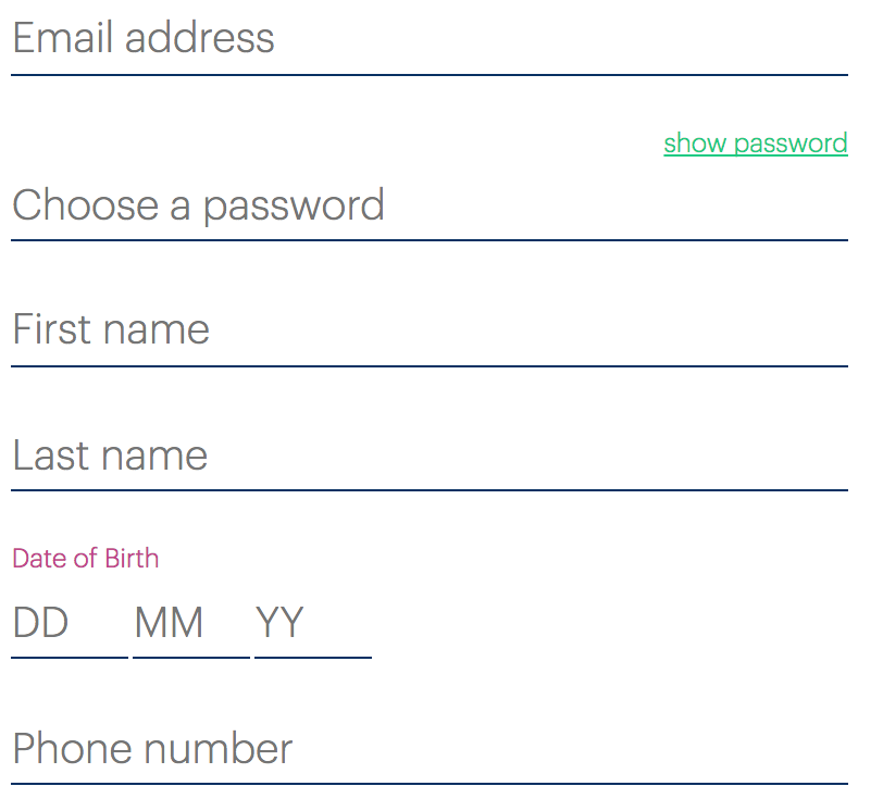
In the Join site’s Payment details page, persistent visual labels accompany placeholders. The issue here is that the <label>s are actually <div>s and are not associated accessibly with the form inputs.
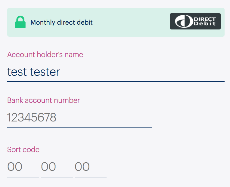
Account dashboard
The Submit an electricity meter reading page’s inputs (pictured) each have a missing label and no placeholder as a substitute.
Fixing the issue
Placeholder labels
In some cases, such as search fields where the label of the submit button, “search”, acts as a visible label, a persistent visual label is not really necessary and an invisible textual label need only be provided for assistive technology users. However, on the Bulb sites the “Get a quote” (or “Get my quote”) label for the submit button does not match the “Your post code” placeholder label.
A label that is both visually persistent and forms the accessible label for the field is therefore recommended.
<label for="postcode">Your postcode</label>
<input id="postcode" name="postcode" placeholder="E.g. NR9 5NF">
<button type="submit">Get my quote</button>
- The
<label>element should be associated with the… - …
<input>by matching the values of the respectiveforandidattributes. - The
placeholderis now optional, but should be clearly marked as an example/hint to be replaced, such as by prefixing with “E.g.” if included.
Payment details page
For the Payment details page, ensure a proper <label> element is used, and is associated to the <input> using for and id as in the above code example.
Input sets on the My information and Payment details pages
The “Date of birth” and “Sort code” fields are related and must have a group label. Using the “Date of birth” set (pictured) as an example, follow the code example provided.

<fieldset>
  <legend>Date of birth</legend>
  <label for="day" class="visually-hidden">Day in D D format</label>
  <input id="day" name="day" placeholder="DD">
  <label for="month" class="visually-hidden">Month in M M format</label>
  <input id="month" name="month" placeholder="MM">
  <label for="year" class="visually-hidden">Month in Y Y format</label>
  <input id="year" name="year" placeholder="YY">
</fieldset>
- The
<legend>forms the group label (this only works if all the elements are within a<fieldset>, as shown). - The label is hidden visually but available to screen reader users (see the definition of
.visually-hiddenin the next section). - Since the label is hidden, we can provide more helpful information to screen reader users. For the payment page “Sort code” example, you should use “First two digits” and so on.
- The placeholder can remain as-is.
Submit an electricity meter reading
In this case, both a group label and individual labels are missing.
For the Submit an electricity meter reading, include invisible but accessible labels in the form “First number”, “Second number” etc for each input/number. In addition, put the <h4> (which ought to be an <h2> — see Heading structure) and description inside a <legend> and group all the controls inside a <fieldset> as in the following code example:
<fieldset>
  <legend>
    <h2>New electricity reading</h2>
    <p>Enter all the numbers you see on your meter</p>
  </legend>
  <!-- each loop -->
  <label for="number-1" class="visually-hidden">First number</label>
  <input type="number" id="number-1" class="sc-RefOD cAjWea" name="number-1" value="0" required="">
  <!-- end each loop -->
</fieldset>
- A special class must be used to hide the label visually, but not from assistive technologies (screen readers). The class is defined below.
.visually-hidden {
  position: absolute;
  white-space: nowrap;
  height: 1px;
  width: 1px;
  overflow: hidden;
  clip-path: inset(100%);
  clip: rect(1px, 1px, 1px, 1px);
}
Payment settings issues
The following is an accessibility review of the payment settings pages found from dashboard/payments-and-statements/payment-settings.
Heading structure
Main page
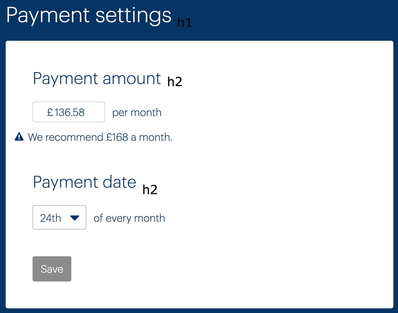
The heading structure is not correct. “Payment Settings” should be an <h1> (because it is the main heading of the page) and both “Payment amount”, “Payment date”, and “Payment details” should be <h2> (as subsection headings directly under “Payment Settings”). See below (“Payment details” not pictured).
Setup New Direct Debit page
“Setup New Direct Debit” should be an <h1> (and “Confirm New Direct Debit Details” on the confirmation page). The labels are currently <h4>s, which is incorrect in terms of hierarchy. Either remove the headings and just have <label>s or mark them up as <h2> headings with <label>s inside them.
(Note: the TextInput component does not currently support labels-in-headings. Should probably be possible.)
Labels
The form markup currently does not make good use of labels to ensure screen reader users have fields identified to them on focus. This is the job of the <label> element, which takes a for attribute that should point to the field’s id. The current mechanism of having a label followed by an input, then “per month” or similar is not recommended. Instead, reword the headings place labels within them. Full examples to follow, with notes.
Payment amount example
<h2>
  <label for="payment-amount">
    Monthly payment amount
    <span>We recommend £168 per month</span>
    <span class="visually-hidden">(in pounds)</span>
  </label>
</h2>
<input id="payment-amount" value="136.58" />
- The heading should be an
<h2>(See Heading structure, above). - The
<label>needs aforattribute, pointing to the input’sid. - The description should be above the input. Below the input is only for errors, as prescribed by the
TextInputcomponent. - This is for clarification to screen reader users who do not have access to the
£sign displayed. See for theclassthat makes this work. - (See 2)
Payment date
<h2>
  <label for="payment-date">
    Monthly payment date
  </label>
</h2>
<input id="payment-date" value="136.58" />
Setup New Direct Debit page
The same rules as outline above should be followed for the (pictured) form elements. Be sure to adopt the new “boxy” input design by using the TextInput component from the design library.
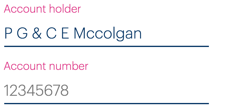
The sort code example (pictured) is a special case because it is a group of inputs. “Sort code” should be a group label, provided via a <legend>. The individual inputs will need their own (invisible) labels. See the code below.
<fieldset>
  <legend>Sort code</legend>
  <div>
    <label for="first-digits" class="visually-hidden">First two digits</label>
    <input id="first-digits" placeholder="00" />
  </div>
  <div>
    <label for="second-digits" class="visually-hidden">Second two digits</label>
    <input id="second-digits" placeholder="00" />
  </div>
  <div>
    <label for="third-digits" class="visually-hidden">Third two digits</label>
    <input id="third-digits" placeholder="00" />
  </div>
</fieldset>
- The
<legend>describes the entire group of inputs - The invisible
<label>clarifies what each individual input is for to screen reader users
The checkbox (pictured below) should use the new Checkbox component (currently it appears to be accessible, but does use two labels for some reason).

Errors
You should be using TextInput from the design library to create text inputs. This has many of the described features built in, including the accessible display of error messages, using aria-describedby to associate the error message to the input and aria-invalid to signify invalidity on the input.
The following is an approximation of how TextInput marks this up, using “Payment amount” as an example.
<h2>
  <label for="payment-amount">
    Monthly payment amount
    <span>We recommend £168 per month</span>
    <span class="visually-hidden">(in pounds)</span>
  </label>
</h2>
<input id="payment-amount" value="136.58" aria-invalid="true" aria-describedby="payment-amount-error" />
<div class="error" id="payment-amount-error">Invalid monthly payment</div>
aria-invalidmust be applied to the invalid fieldaria-describedbyassociates the input to the error using the error’sid- (See 2)
List structure
The details under “Payment details” (pictured) need to be marked up as a definition list.

Lists and definition lists give structure to screen reader users, who then find the content easier to understand and navigate.
Here’s how the code should look:
<dl>
  <dt>Account holder</dt>
  <dd>P G & C E Mccolgan</dd>
  <dt>Account number</dt>
  <dd>*****879</dd>
  <dt>Sort code</dt>
  <dd>56-00-41</dd>
</dl>
- The
<dt>(definition title) is the key/label for the definition - The
<dd>(definition) is the value
The confirmation page for changing the direct debit details (see below) should also use this structure (and have a similar visual design; the current one is very difficult to understand).
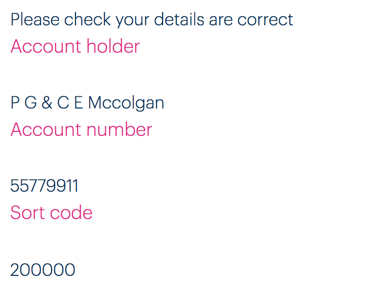
Routing
You will need to manage focus between routes by focusing the <h1> on each screen and updating the <title> to something that is more descriptive of the exact screen. For example: “Bulb Account - Confirm New Direct Debit Details” instead of the generic “Bulb Account — Edit Payment Details”. More detail on routing here: Routing.
Routing
Introduction
Single-page applications present some unique challenges for accessibility, particularly in regard to routing and the navigation of views.
Views (or ‘screens’) in single-page applications attempt to emulate pages in more traditional multi-page sites. Visually, the experience is similar (some content is replace with some other content). However, when replacing content by manipulating the DOM in situ, the experience for screen reader and keyboard users is lacking. Unlike when a page is loaded, a switch in views does not announce the page’s <title>.
Keyboard focus is also problematic, since the link focused in the previous view will have been removed from the DOM. When a true page is loaded, focus is moved to the top of the document. Between views, it becomes lost somewhere in the middle of the document.
There are a few basic provisions for accessible routing:
- The URL should change, to reflect the new location
- The back button behavior should be intact
- The
<title>should change, to reflect the new location - Focus should be moved to a convenient location after the new DOM structure is in place
WCAG criteria
- 2.4.2 Page Titled (level A)
- 2.4.3 Focus Order (level A)
- 2.4.5 Multiple Ways (level AA)
Scope of the issue
Both the Join site and Account dashboard are affected, since they are built in Angular and React respectively.
The Join site in particular, has some issues between the ‘question’ pages, in that the URL and <title> do not change.
Fixing the issue
The outer element for each view component should either be a <main> or a wrapper <div> within <main>.
When the component that represents the content of the chosen view is mounted (componentDidMount() in React), augment the page in the following ways:
- Update the
document.title(based on apropvalue is probably most efficient). - Update the URL (this is automatic using
React-Router, but this is not taking place on the Join site, using Angular), - Move focus to the
<h1>heading within the<main>element. This will announce the heading and place the keyboard user at the start of the view’s content. Setting “h1” as a ref will help.
Code
componentDidMount() {
  document.title = this.props.title
  this.refs.h1.setAttribute('tabindex', '-1')
  this.refs.h1.focus()
}
- Before being able to focus the heading, a
tabindexvalue of-1is applied. This value allows elements to be focused programmatically (with thefocus()method) but does not place the non-interactive element into ‘focus order’, which would be confusing to the user.
Skip links
Introduction
WCAG 2.0 mandates a ‘bypass’ mechanism to enable users that navigate web pages by keyboard to skip over introductory content and go directly to the main (unique) content of the page. Without such a provision, accessing page content can be time consuming and arduous.
With the introduction of landmark elements like <main>, it has become easier for screen reader users to navigate between the larger sections of the page using software-specific shortcuts. However, sighted keyboard users frequently do not run screen readers, and many screen reader users are not aware of these new features.
A special same-page hyperlink (often called a ‘skip link’) at the beginning of the page source, and pointing to the <main> element, allows the user to skip over the header and navigation of the page where desired.
WCAG criteria
- 2.4.1 Bypass Blocks (level A)
Scope of the issue
None of the Bulb sites’ pages provide skip links.
Fixing the issue
The skip link element needs an href that points to the id (document fragment) of the <main> element. Fortunately, a <main> element is already provided in some cases. Where it is not, you must provide one. It should wrap the main content of the page — the content below the header and above the footer, basically.
HTML
<body>
  <a href="#main">skip to content</a>
  <!-- header and navigation, etc -->
  <main id="main" tabindex="-1">
    ...
  </main>
- Note that
tabindex="-1"has been applied. This fixes same-page focus behavior in some older browsers.
CSS
A persistent skip link at the top of the page is considered clutter by many designers. Instead, you can hide the skip link off-screen until it is focused by keyboard.
[href="#main"] {
  position: absolute;
  right: 100%;
}

[href="#main"]:focus {
  position: static;
}
- Hiding the link off-screen can be done a number of ways, but using a
100%positioning value is probably one of the more efficient - To place the link back into the flow of the page on focus, simply change the position property to
static. If you want the link to overlay the page, keep theabsolutepositioning and change theleft,right, andtopvalues to your liking.
Text alternatives
Introduction
For blind users, textual alternatives of important visual information must be provided. Composing that text effectively is a question of context.
For example, a logo that is intended as a study in logo design should include a textual alternative — typically via an <img> tag’s alt attribute — that describes the features of the logo, such as the colors and typography. For Bulb’s logo this might read something like, ” expressive, hand written text, in white, and featuring hooped ascenders”.
On the other hand, where the logo is used as the content of a link to the site’s home page, “Bulb home page” would suffice. That is, the action of the link is pertinent to the user, not the design of the lettering.
Decorative images, which include no salient information, are obstructive to non-visual users and must be removed from screen reader output. The only reliable way to do this is by providing alt="" (empty value). Omitting the alt attribute altogether will result in browsers and screen readers falling back to reading the src value, which is rarely helpful.
Be careful to avoid redundant alternative text. Where the same information is provided as text and an image, you should consider the image decorative (see above).
WCAG criteria
- 1.1.1 Non-text Content (level A)
Scope of the issue
Marketing site
Home page
The switch steps (pictured) have identical, redundant alternative text to the visible text provided. You must use an empty (alt="") value for each of these.
The ‘listening’ and ‘best of’ illustrations (pictured) are decorative, but omit the alt attribute, meaning their role and src will be announced. Include alt="" to suppress this.


The social media links (pictured) have strange alternative text, derived from the SVG data. For example, the Facebook link is just “bulb”, and the YouTube link is a random string of characters. In each case, use the form “Bulb on [social media company]” and apply this label as an aria-label attribute to the outer SVG element (aria-label="Bulb on [social media company]").


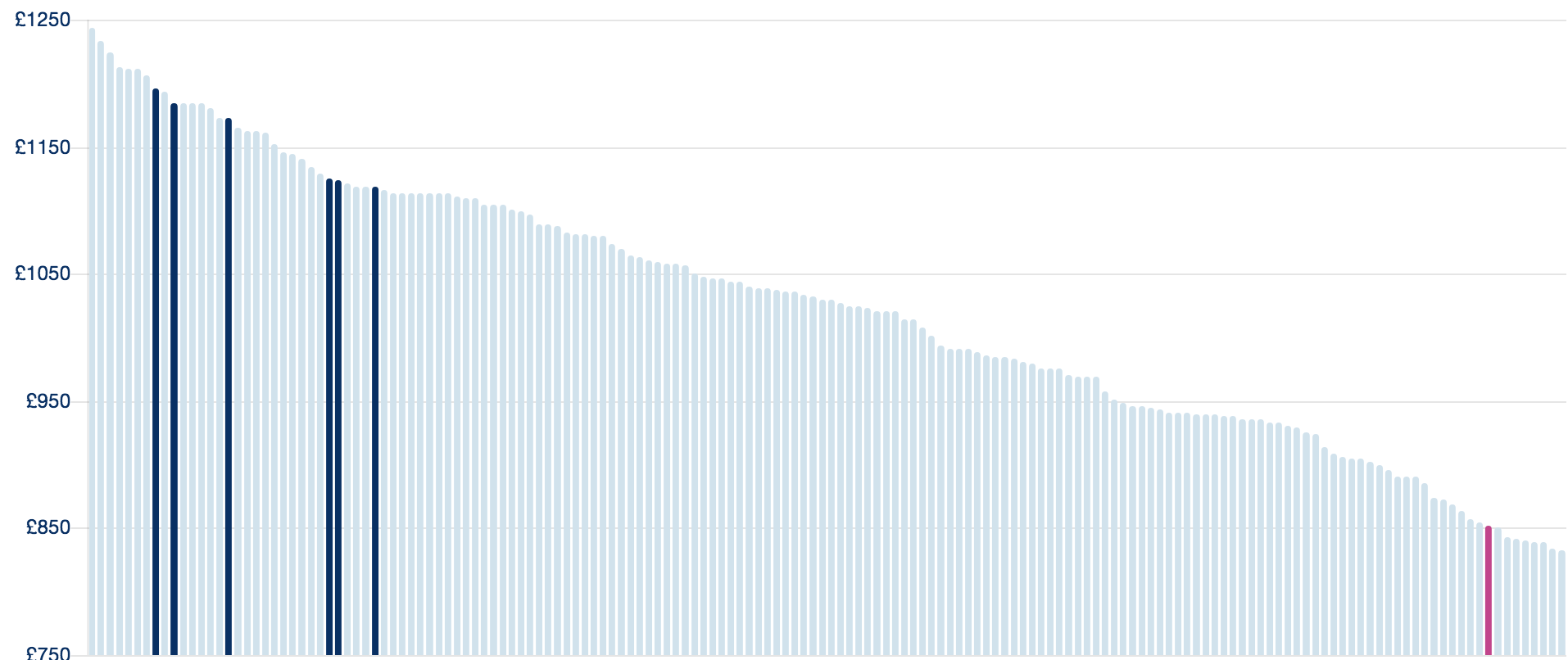
The Cost of energy for a typical home chart is deceptively simple in terms of the information it imparts. Where other charts might need an alternative presentation of the data, as a table, this <canvas> element can simply be given role="img" and an aria-label for the alternative:
<canvas role="img" aria-label="Chart showing the cost of more than 100 energy providers. Bulb is not only in the 10 cheapest providers, but is also 100% green.">
</canvas>

Since the key for the chart (pictured with the chart above) and title for the chart (“Cost of energy for a typical home”) are no longer needed non-visually, they can be removed from screen reader output with aria-hidden="true".
<ul class="chart-labels" aria-hidden="true">
  <li><div class="legend-swatch label--navy"></div>Big Six standard tariff</li>
  <li><div class="legend-swatch label--grey"></div>Others</li>
</ul>
About → Our energy
The “Greening up the grid” illustration (pictured) is decorative but omits an empty (alt="") attribute. Ensure that this is present to suppress readout of the image.
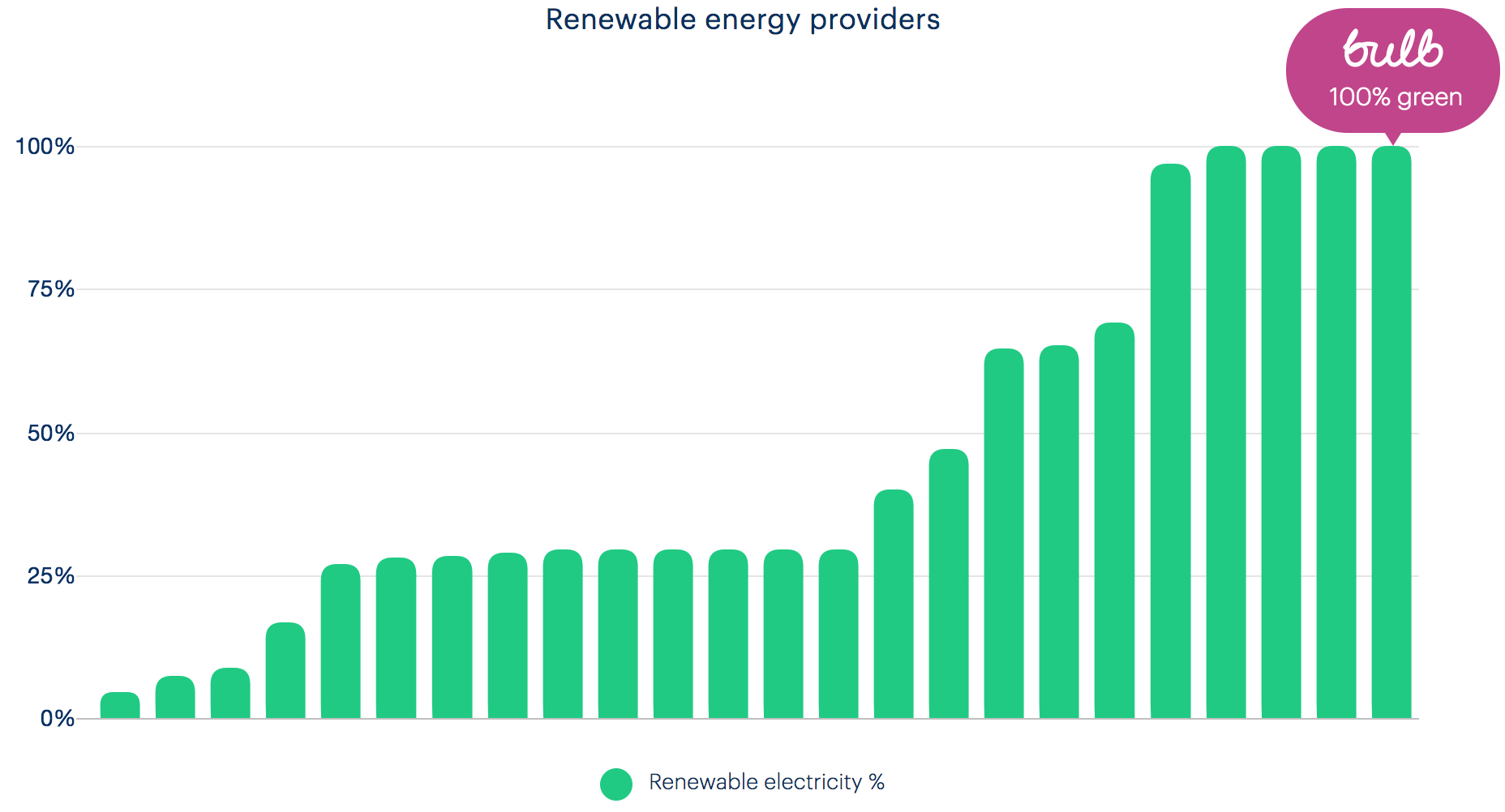
The “Renewable energy providers” chart (pictured) is deceptively simple. The simple solution is to place role="img" and an aria-label with a value of “Chart shows that Bulb’s energy is one of only four 100% green energy providers”.

In addition, hide the now unnecessary key (“renewable electricity %”) and title (“Renewable energy providers”) from assistive technologies using aria-hidden="true" on each containing element.
About → Careers
The living wage and ‘certified B’ images have a filename as the alt and a missing alt, respectively. These are not decorative images, so should have “We are a living wage employer” and “Certified B Corporation” alternative texts.

The “Come make energy better” and “Working At Bulb” photos have poor alternative texts of “Bulb March 3rd-147.jpg” and “Bulb March 3rd-262.jpg”, respectively. You can consider these images decorative and supply empty alternatives (alt="").


About → Business
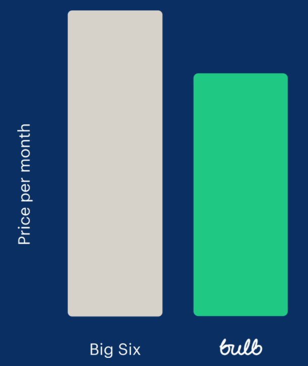
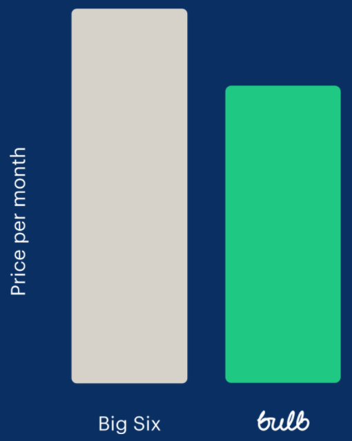
The alternative text for the ‘Big Six versus Bulb’ chart (pictured) is inadequate as simply “bulb-business-chart”. Since the information it provides (that Bulb’s prices are 20% cheaper) is covered in the accompanying text, it can be treated as decorative. Empty the alt attribute but leave it in place (alt="").
The photo of the beach is also decorative and should have alt="".
Trust Pilot instances
The Trust Pilot widget (found on the Home page and About → business page) is an <iframe> with a lot of content and JavaScript, amounting to 80KB+ (!) of payload. The purpose of the widget is simply to link to Bulb’s Trust Pilot page.

In which case, I recommend the <iframe> is replaced by a simple image, linked to that page. See the code example below with the
Join site
The graphics throughout the Join site (example pictured) are rendered as CSS background images on <div> elements. Since they are exclusively decorative images, this is not an issue in terms of alternative text (they already will not be announced). However, background images are typically eliminated when users (some of whom with impaired vision) activate Windows High Contrast Mode.

Since the graphics assist comprehension for sighted users, it is recommended that the high contrast mode-proof method of supplying <img> tags with alt="" is employed.
One exception is the price comparison bar chart found on the “Switch Now” page. This must have a proper description in a form similar to “Bar chart shows Bulb’s price at around £80 compared to the prices of the big six energy companies, all significantly over £1000”.
Account dashboard
The My usage chart is handled in the Component issues section because it needs a more complex alternative text approach.
Fixing the issue
For convenience, solutions are included inline in the Scope of the issue section, above.
Wording
Introduction
It’s not enough that elements in a web page’s HTML are marked up correctly. Where they provide textual labels, these labels need to be readable and descriptive.
- Headings must clearly describe the sections they introduce
- Labels for links, buttons and form elements must clearly describe the purpose of those controls
- Page titles must sufficiently describe the page and its purpose
Since headings and links are aggregated into lists by screen reader software, it is important they make sense independent of context. For example, “It’s Great!” may make sense proceeding a paragraph where the “it” of the heading is defined, but will be mysterious as a heading in a reductive list of just the headings present in the page. Similarly, links reading “click me” or “more” are of little use in an aggregated list, especially where there are many sharing the same generic label.
The page’s main (<h1>) heading must be a subset of the page’s <title>. Ordinarily you would include the name of the site along with the name of the page, e.g. “Bulb: About Our Energy” or “About Our Energy — Bulb”. This way, a user with many tabs open know which pages belong to which sites. The name of the page should be similar to the content of the <h1>.
Finally, it is important that parts of the interface are identified consistently, using the same terminology. This includes pairing the terminology in link text to the destination page’s <title> and main heading text.
WCAG criteria
- 2.4.2 Page Titled (level A)
- 2.4.4 Link Purpose (In Context) (level A)
- 2.4.6 Headings and Labels (level AA)
- 3.2.4 Consistent Identification (level AA)
Scope of the issue
Marketing site
- Home page (✖️ The “Read more” link in the press section doesn’t mean anything out of context.)
- About → Our energy (✖️ The page’s main heading is not “Our energy” or anything similar to the
<title>; the<title>includes the imperative “Join Bulb”, which is not the primary purpose of the page.) - About → Careers (✖️ The main heading “Bulb is growing” does not use the “careers” term of the
<title>and navigational link text, which those with cognitive impairments may find confusing; the<title>includes the imperative “Join Bulb”, which is not the primary purpose of the page.) - About → Business (✖️ The
<title>includes the imperative “Join Bulb”, which is not the primary purpose of the page.)
Join site
- Between each screen, the page URL and the page content changes, but the
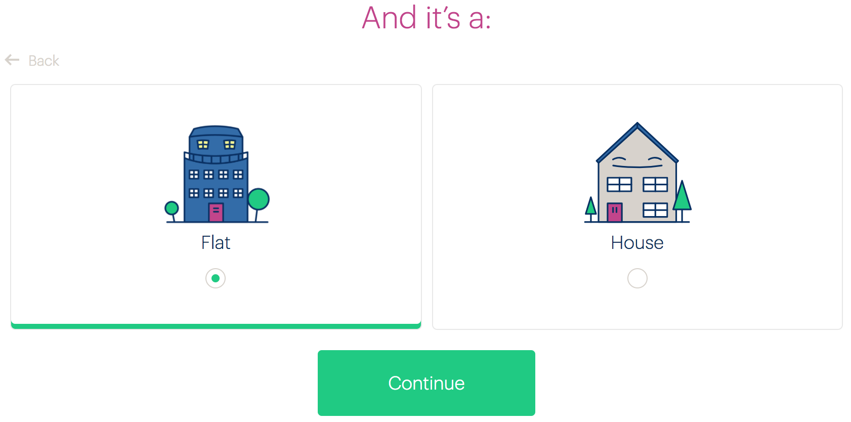
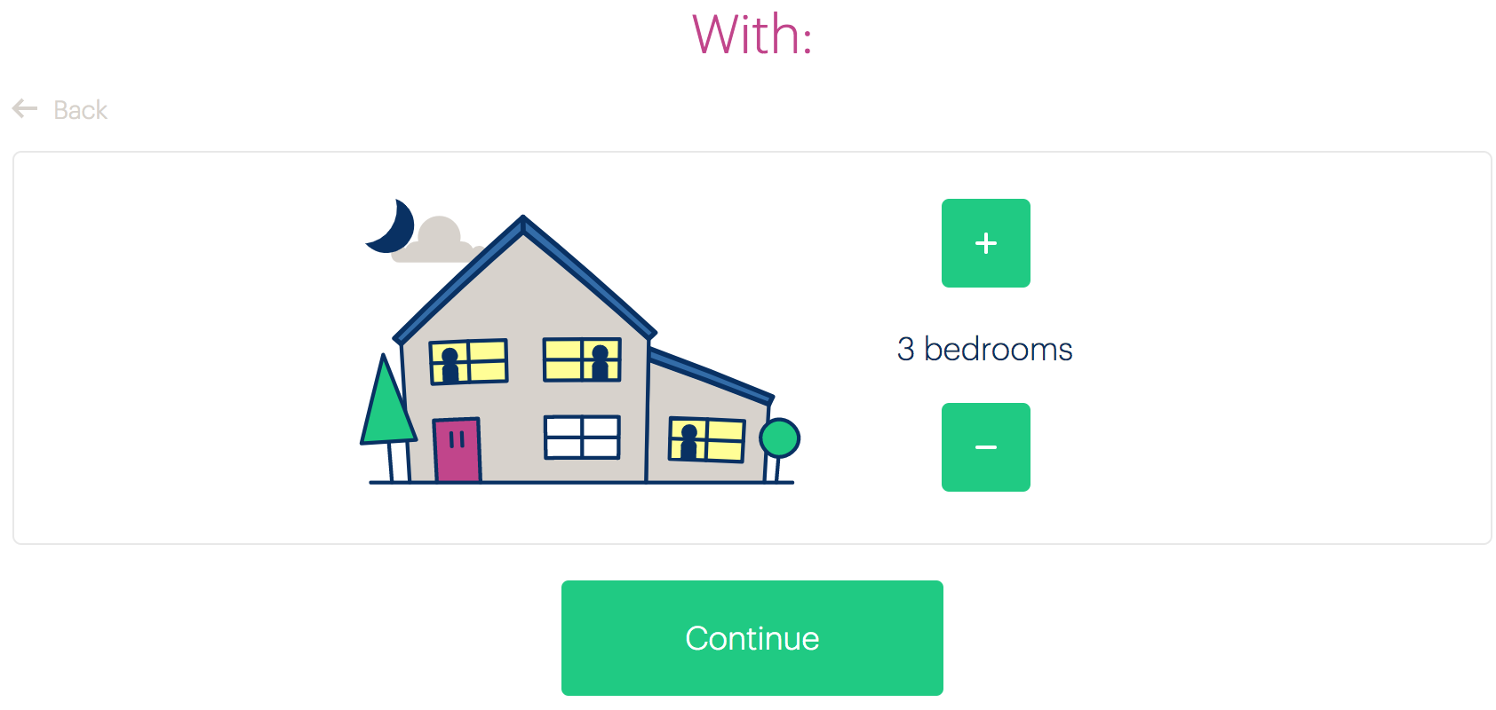
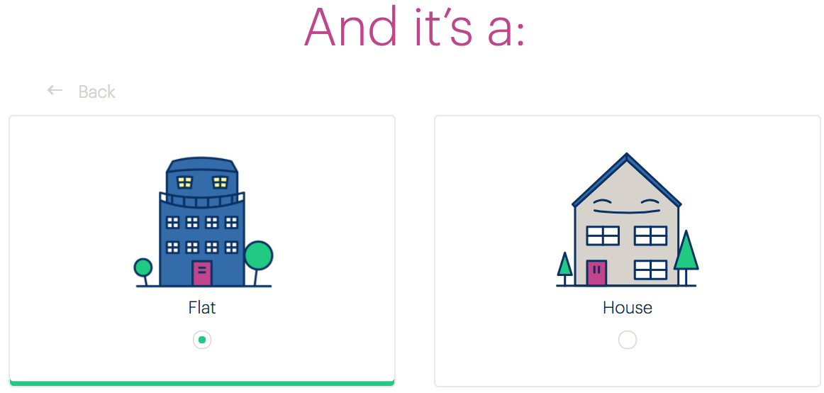
<title>remains “Bulb — Get A Quote”. - The second and third question pages (pictured) have the main headings “And it’s a:” and “With:” respectively, which is fragmentary and unhelpful, especially given that screen reader users are likely to have content in the page preceding these headings read to them as they arrive.
Account dashboard
- On the Login page, the page
<title>is “MyBulb — Your account” suggesting the user is already logged in. - On the Submit an electricity meter reading page, the back button reads “Back to MyBulb”, but points to the page where you choose which type of reading — gas or electricity.
Fixing the issue
Marketing site
- Remove the ‘Join Bulb’ terminology from the
<title>s. This imperative only really applies to the Join site and may cause confusion when used too prolifically in this way. - Avoid generic terms like “Read more”. The link under the press logos can read something like “Bulb press”, “In the press”, “More press mentions”, or similar.

Join site
- Add a third part to each
<title>identifying the specific screen in the form “Bulb — Get A Quote — [specific page description]”. For example, “Bulb — Get A Quote — Bedrooms” for the bedrooms screen. - Avoid trying to compose sentences across screens/pages. This will not work for many assistive technology users, and all sorts of users will simply forget what came before in the sentence. Try headings like “The energy I use is”, “I live in a”, and “The number of bedrooms I have is”.
Account dashboard
- Change the login page title to something similar to “MyBulb — Log in to your account”.
- Instead of changing the wording of the back button on the reading page, actually link back to the main dashboard page. There is no need to step back through the intermediary page.
Component Testing
The following is a guide on how to test new components for accessibility. No new components created for the Bulb interfaces should reach production without passing these checks.
Automated testing
Before manual testing, you need to check that the component passes for basic WCAG (A and AA) success criteria. Tools designed to detect WCAG failures differ in their scope and accuracy, so you will use a selection (see below). Where one tool reports a problem but another doesn’t, it is more likely to be a false positive. Manual testing will help to confirm.
Pa11y
Pa11y provides a CLI for testing against single URLs, including localhost URLs such as those running off the design library’s Catalog. It logs errors in your console. Install it globally, then run it against your URL of choice.
npm install -g pa11y-cipa11y https://bulb.co.ukLighthouse
Lighthouse is an accessibility, performance, and PWA testing tool from Google. It is available as a CLI, but is probably easiest to use in its browser extension form.
Once installed, navigate to the page with the component on it you want to test, then open developer tools and choose the Audits tab. Press the “Perform an audit” button and uncheck everything but accessibility.
HTML Code Sniffer
This tool works as a bookmarklet and has a high degree of accuracy. Drag the bookmarklet to your bookmarks bar and click the bookmarklet on the component page you want to test. Make sure “Standards” is set to WCAG2AA from the dropdown. Ignore notices, but test warnings manually if you believe there may be a real issue.
Manual testing
Keyboard
Screen reader
Zoom
Component checklist
Before any component can be included in the pattern library, ensure it passes all of the following tests:
- Each visible interactive element can receive focus and be activated by keyboard, and no invisible elements can be focused using the keyboard
- No non-interactive elements can be focused by keyboard
- Interactive elements have focus styles and receive focus in a logical order
- Each element has the appropriate role — preferably implicitly because it is the correct element (e.g. the button role, because it is a
<button>) — or via the ARIAroleattribute - Where elements change state, the state is communicated semantically and not just by CSS style (examples: using
checked, oraria-expanded="[true|false]") - Iconography is provided as inline SVG, and uses
currentColorforfillso that Windows High Contrast Mode is honored when switched on - Images that are non-decorative have appropriate alternative text (see Text alternatives
- Images that are decorative (contain no useful information non-visually) have an empty
altattribute (alt="") - The correct heading structure is employed for the component’s placement in the document outline (see Component heading levels for changing heading level per instance of a component)
- Form elements are associated to their labels using
forandid(see Missing and placeholder labels) - Invalid form fields have
aria-invalid="true"and error messages associated to them usingaria-describedby(see Form errors)
Component heading levels
Reusable components will appear in different contexts, at different levels in the document heading structure (see Heading structure). It should therefore be possible to change the heading level of the component’s main heading via a level prop.
The aria-level property/attribute can then be used to change the perceived level in assistive technologies. Note that aria-level only works on heading elements (<h1> — <h6>) or elements with role="heading". It is recommended the default prop value is 2, since most components will start at that level.
<!-- component code -->
<h2 aria-level="{this.props.level}"></h2>

<!-- instance -->
<MyComponent level="3" />

<!-- how a screen reader perceives the MyComponent heading -->
<h3>Component name / main component heading text</h3>
Form Validation
The Bulb sites should each conform to the same set of prescribed form validation behaviors as set out below. These behaviors are optimized for usability and accessibility and should be implemented consistently.
Let users submit
There are a number of usability issues associated with disabled (submit) buttons.
- Difficult to discern as disabled (especially when color blind)
- Do not tend to explain why they are disabled
- Not focusable, therefore not easily discoverable using a screen reader
- More here
Instead of disabling the submit button until the form is valid, we should allow users to attempt submission and tell them there are errors where they arise. By using instant error handling (see below) few users should reach the end of the form with invalid fields.
Types, descriptions, and placeholders
Ideally, we don’t want to be throwing and communicating errors at all. So it is important to guide the user from the outset and help them not make mistakes. Using correct input types, descriptions, and placeholders should mitigate error handling.
- Types: Using an appropriate type has benefits such as suppressing the entry of incorrect characters, and displaying an appropriate virtual keyboard configuration. Use
type="number"for fields expecting numbers only. - Descriptions: These should appear inside the
<label>element, below the main label text and above the input itself. Use a sentence or two to explain what input is expected. Not necessary for common fields such as name or email. The<TextInput>component in the pattern library comes with adescriptionprop. - Placeholder: Avoid using the
placeholderelement as a substitute for the<label>. Instead, where appropriate, provide an example of valid entry. For example:e.g. Heydon666for a username field. The “e.g.” prefix is important because it makes it explicit that it is a suggestion only, and not a prepopulated value.
Example
By making the description part of the <label> it is available to assistive technologies upon focusing the field. In the following example, the description is demarcated using a <small> element. This would most likely be set to display: block.
<label for="discount-code">
  Discount code
  <small>The five digit code sent to you by email.</small>
</label>
<input type="number" id="discount-code" name="discount-code" placeholder="e.g. 56291" />
Note that the least important part of the above example is the placeholder which can be omitted in most cases. The description takes precedence for inputs that need explaining.
Before submission
For each field, ensure that:
aria-invalidis not present on any fieldsaria-requiredis set totrueif applicable (set it on the parentfieldsetfor radio groups where no default radio is selected). In some circumstances, you may want to append the label with an asterisk; a conventional way to show it is required. However, since optional fields are less common, it is more important to pick them out, by appending ”(optional)”.- Complex input requirements are handled with a description inside the
<label>, or<legend>for radio button fieldsets - A live region is present in the page, directly above the submit (and cancel) button (see General error message, below)
Also ensure the parent form has the novalidate attribute. We are using our own validation process and do not want inconsistently implemented HTML5 validation messages to appear.
No instant error handling
We have deemed instant error handling — as the user types — aggressive and distracting. In some cases, such as positive validation on a name field after one character has been typed, it can also be confusing (especially to users with cognitive impairments).
Instead, fields that are set to validate and display error (and/or) success messages/icons should only do so when the field is blurred. As standard, no positive validation should occur on blur; only mistakes should be highlighted. In some cases, where a very specific form of input is required, positive validation can be performed on blur. Usually this is where a number of fields need to match up mutually, such as a password and password confirmation fields, or a set of bank details.
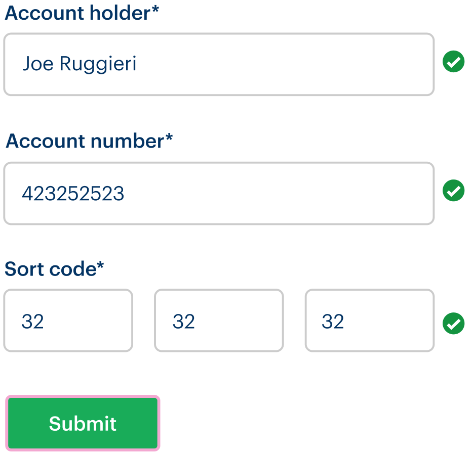
See the design kit for the standard and positive validation flows illustrated.
While screen reader users will not be aware of the validation error until they refocus the field, they will know to do so having received the general error message after attempted submission (defined below).
On submission (with errors)
General error message
On submission, if there are still individual errors present, a general message announcing the presence of errors needs to be included, as a screen reader accessible live region.
Be sure to place this message component directly above the submit (and cancel) buttons so that the user does not need to scroll in order to see it. See the example from the marketing business page below.
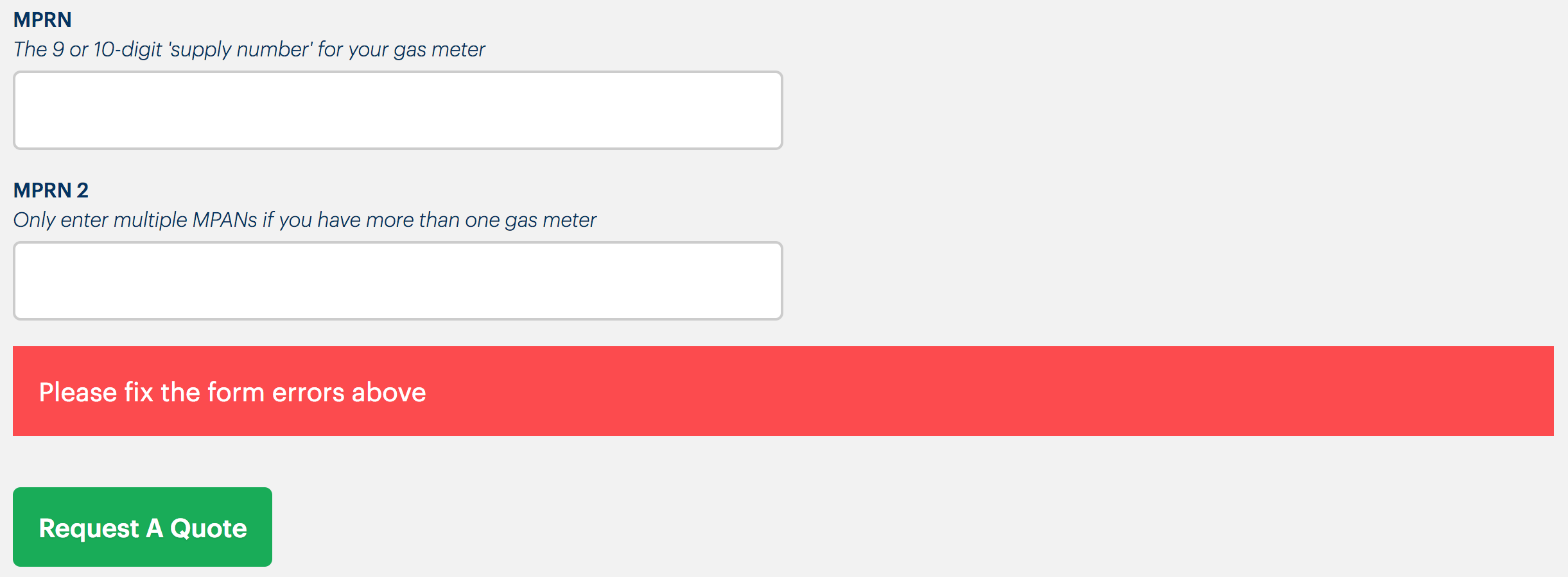
Note that the live region that makes this message accessible should already exist in the page. The message is inserted inside the live region for it to announce correctly in screen readers. If you include the live region with the message, it will not work.
<!-- before insertion -->
<div role="alert" aria-live="assertive">
</div>

<!-- after triggering -->
<div role="alert" aria-live="assertive">
  <p class="message">
    <svg aria-label="error">...</svg>
    Oops! Your form has some errors. Please fix them before continuing.
  </p>
</div>
Individual fields
After attempted submission, for each field ensure the following. Note that empty required fields would now be considered as invalid, and display error messages.
- Where the field is valid:
- The field element/input, or
<fieldset>for radio buttons, has noaria-invalidattribute
- The field element/input, or
- Where the field is invalid or empty but required (including for radio button sets):
- The field element/input, or
<fieldset>for radio buttons, hasaria-invalid="true" - An error message is associated to their input/field, or
<fieldset>for radio buttons, usingaria-describedbywith a value of the error message element’sid - The error message appears directly below the input or
<fieldset>in question - The error message should be accompanied by an error symbol (see the illustration of
<FormGroup>below)
- The field element/input, or
Invalid radio buttons example
This is the pattern needed for invalid — because a choice is required — radio button <fieldset>s.
<fieldset aria-describedby="error" aria-required="true" aria-invalid="true">
  <legend>Output format</legend>
  <div>
    <input type="radio" name="format" id="txt" value="txt">
    <label for="txt">Text file</label>
  </div>
  <div>
    <input type="radio" name="format" id="csv" value="csv">
    <label for="csv">CSV file</label>
  </div>
  <div>
    <input type="radio" name="format" id="html" value="HTML">
    <label for="html">HTML file</label>
  </div>
  <p id="error">You must choose one option</p>
</fieldset>

Validation flow in pictures
The following diagram steps though eight steps of a typical form validation flow. Each numbered step is described below the diagram.
- The first (required) field is focused, showing the blue focus style.
- When the field is blurred after the user has not entered input, the error style and message appears.
aria-invalid="true"is applied to the input, and the error message is associated with the input’sidusingaria-describedby="[the id]". - The user could go back up straight away to fix the field, but in this case continues to fill out the second field which has now been focused.
- When this Last name field (which is simply required and has been filled out) is blurred, showing no successful message as it is not needed, and the user begins to type into the email field.
- The field is filled out correctly (a valid email format is used).
- When the submit button is pressed, there are still errors in the form. In which case, the general error message (inserted in an ARIA live region, see above) appears. This alerts sighted and blind users to move back up the form to fix the errors.
- The user moves focus up through the successfully completed fields and focuses the first, invalid field. The focus style overrides the error style but the message remains to help instruct the user in fixing the error. This is particularly important for fields expecting a certain format and requiring specific instructions.
- When the corrected field is blurred, the error style is removed, as well as
aria-invalid="true". The general error message disappears because it is no longer applicable. The user is free to submit. Pictured: the second field is focused on the (keyboard) user’s way down to the submit button.
After submission (no errors)
If submission was successful, this needs to be clear. There are a few things to consider depending on the circumstances.
- Does the form itself disappear (is it removed from the DOM)? You should programmatically focus a success message such as “Password successfully updated” (using a React
refandfocus(), typically) - Is the user redirected to a new page? Make sure that page includes some kind of success message. The easiest way is to probably include it in the page
<title>(e.g.<title>Your account settings (you successfully changed your password)</title>). An additional flash message in the page (below the main title) is recommended.
Marketing site homepage HTML
The following is a template for the marketing site’s HTML documents, using the homepage content to describe an example structure. Each page in the marketing site should follow the prescribed <title> pattern, include lang on the HTML element, and a skip link etc.
<!DOCTYPE html>
<html lang="en">
  <head>
    <meta charset="utf-8">
    <meta name="viewport" content="width=device-width, initial-scale=1.0">
    <meta http-equiv="X-UA-Compatible" content="IE=edge">
    <title>[Site name] | [Page name]</title>
  </head>
  <body>
    <a href="#main">skip to content</a>
    <header>
      <a href="/" aria-label="Bulb homepage">
        <svg><!-- Path data --></svg>
      </a>

      <nav>
        <!--
          Site naviagtion (get a quote, about etc)
          Needs to be an unordered list of links!
        -->
      </nav>
    </header>

    <main id="main" tabindex="-1">
      <div class="component page-leader">
        <h1>Making energy simpler, cheaper, greener</h1>
        <p>Switch now and save up to £350</p>
      </div>

      <div class="component get-a-quote-form">
        <label for="postcode">Enter postcode</label>
        <input type="text" id="postcode" aria-invalid="false">
        <div class="error" id="error-postcode">
          <!-- Enter error text here on error -->
        </div>
      </div>

      <div class="component image-and-text">
        <div class="image">
          <img src="[src]" alt="[empty if decorative, descriptive/evocative if not]">
        </div>
        <div class="text">
          <h2>The most trusted energy supplier in the UK</h2>
          <p>For us, <a href="[url]">customer service</a></p>
          <!--
            Start Trust Pilot image example
            (see https://heydon.github.io/bulb-audit/patterns/general/textual-alternatives/#trust-pilot-instances)
          -->
          <a href="[url]"
            <img src="[src]" alt="Bulb on Trust Pilot (9.8 out of 10)">
          </a>
          <!-- End Trust Pilot image example -->
        </div>
      </div>

      <!--
        Further text/image sections here.
        Charts covered in https://heydon.github.io/bulb-audit/patterns/general/textual-alternatives/
      -->
    </main>

    <aside aria-labelledby="press-heading">
      <h2 id="press-heading" class="visually-hidden">Bulb in the press</h2>
      <!-- Unordered list of images with descriptive alt texts (names of papers) and quotes -->
    </aside>
    <footer>
      <!--
      Pink headings should be <h2>.
      Social media icons should be a list and images should have text alternatives
      (see https://heydon.github.io/bulb-audit/patterns/general/textual-alternatives/#home-page-https-bulb-co-uk and https://heydon.github.io/bulb-audit/patterns/general/list-structure/)
      -->
    </footer>
  </body>
</html>
Navigation markup
The navigation portion of the pattern library header needs to conform to a certain markup structure for accessibility and efficiency. Here is some code to get you started, with comments to follow.
The following shows the navigation system in the desktop configuration, with the Menu button hidden and the “About us” dropdown hidden also.
<header>
  <!-- skip link here (see `<SkipLink/>`) -->
  <div class="navigation">
    <div class="logo">
      <a href="/">
        <img src="path/to/logo.svg" alt="Bulb homepage" />
      </a>
    </div>
    <div class="button-and-links">
      <button hidden aria-expanded="false" aria-haspopup="true">Menu</button>
      <nav>
        <ul>
          <li><a href="[url]">Get a quote</a></li>
          <li>
            <a href="[url]" role="button" aria-expanded="false">About Bulb</a>
            <ul aria-label="sub menu" hidden>
              <li><a href="[url]">About us</a></li>
              <li><a href="[url]">Press</a></li>
              <li><a href="[url]">Our energy</a></li>
              <li><a href="[url]">Our service</a></li>
              <li><a href="[url]">Careers</a></li>
              <li><a href="[url]">Our tariff</a></li>
              <li><a href="[url]">Bulb for business</a></li>
            </ul>
          </li>
          <li><a href="[url]">Help</a></li>
          <li><a href="[url]">Sign in</a></li>
        </ul>
        <button aria-label="close" hidden>✖️</button>
      </nav>
    </div>
  </div>
</header>
- A
<div>is used to group the logo and navigation landmark. This should be the child of a<header>element (as shown) which wraps all of the header content (including the<h1>). - The
altfor the logo needs to describe the purpose of the parent link - This
<div>is the second of two siblings that should be placed alongside eachother (Flexbox can push them to either side withjustify-content: space-betweenon the parentclass="navigation"<div>) - The Menu
<button>is hidden on desktop. - The
<nav>is visible on desktop, and is important because<nav>is a discoverable region for screen reader users. IMPORTANT: there is no need to manage two<nav>regions/lists for desktop and mobile. We can just change the styling of this list at different breakpoints. - The link that opens and sends focus to the mobile version of the menu needs these attributes for accessibility.
aria-expandedneeds to be toggled along withopen(betweentrueandfalse) - The sub menu must be a nested list, and takes
aria-label="sub menu"to help screen reader users identify its purpose. On mobile this list would be expanded by default. - The close button is not needed on desktop, so is hidden here.
Mobile configuration (open state)
With comments to follow.
<header>
  <!-- skip link here (see `<SkipLink/>`) -->
  <div class="navigation">
    <div class="logo">
      <a href="/">
        <img src="path/to/logo.svg" alt="Bulb homepage" />
      </a>
    </div>
    <div class="button-and-links">
      <button hidden aria-expanded="true" aria-haspopup="true">Menu</button>
      <nav>
        <ul>
          <li><a href="[url]">Get a quote</a></li>
          <li>
            <a href="[url]" role="button" aria-expanded="false" hidden>About Bulb</a>
            <ul aria-label="sub menu">
              <li><a href="[url]">About us</a></li>
              <li><a href="[url]">Press</a></li>
              <li><a href="[url]">Our energy</a></li>
              <li><a href="[url]">Our service</a></li>
              <li><a href="[url]">Careers</a></li>
              <li><a href="[url]">Our tariff</a></li>
              <li><a href="[url]">Bulb for business</a></li>
            </ul>
          </li>
          <li><a href="[url]">Help</a></li>
          <li><a href="[url]">Sign in</a></li>
        </ul>
        <button aria-label="close">✖️</button>
      </nav>
    </div>
  </div>
</header>
- In the open state, the Menu button is set to
aria-expanded="true" - The
About Bulbdropdown button is not needed for mobile. The user can just enter directly into the list below it - The list therefore is not
hiddenby default - The close button is also unhidden, because it is now needed.
Visually hidden class
In some circumstances, you will want to provide clarifying text to screen reader users which is not necessary for sighted users. The following .visually-hidden class hides text visually without silencing its element’s content in screen readers.
Use it judiciously, since in most cases sighted and unsighted users should be able to read the same content, as part of the same experience.
.visually-hidden {
  clip-path: inset(100%);
  clip: rect(1px, 1px, 1px, 1px);
  height: 1px;
  overflow: hidden;
  position: absolute;
  white-space: nowrap;
  width: 1px;
}
Example usage
<p class="visually-hidden">This text is not visible but will be read out in screen reader software</p>
