About navigation
Priority: 2
Introduction
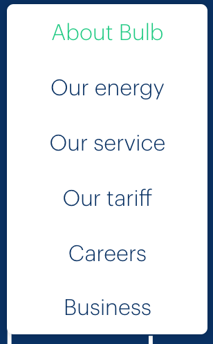
The About pages on the marketing site are currently only available via a dropdown submenu (pictured).

Dropdown submenus are precarious interaction design patterns, prone to accessibility issues. In the case of Bulb’s implementation (which is already keyboard accessible), there are just a few problems:
- The link that activates the menu does not communicate state (expanded or collapsed)
- The menu obscures the activating link/control (see point 6 here)
- The menu does not close when focus is moved from its last item to the adjacent (“Blog”) link.
- The nested list is not identified as a submenu which, though not crucial, would be helpful
It is recommended that dropdown menus are supplemented (or even replaced) by navigation regions placed in the body of each child page. These should contain the same navigation options but do not necessitate being disclosed on click.
- Offer choice : Consider providing different ways for people to complete tasks, especially those that are complex or non standard.
WCAG criteria
- 2.4.3 Focus Order (level A)
- 4.1.2 Name, Role, Value (level A)
Scope of the issue
The Marketing site is currently the only site that offers the About content, but see Inconsistency where a more consistent navigation schema is recommended.
Fixing the issue
It is recommended the enhancements to the dropdown menu noted in the introduction are provided, as well as providing in-page navigation menus for each About child page.
Dropdown enhancements
- Give the top-level “About Bulb” link
role="button"(since it no longer functions as a link). - Include
aria-expandedon the top level “About Bulb” link and toggle betweenfalse(dropdown menu not showing) andtrue(dropdown menu showing). - Move the dropdown lower so as to not obscure the top-level link/control (see the illustration below).
- Add
aria-label="submenu"to the dropdown’s<ul>. - Close the menu when the last item is unfocused in a forwards direction. See the pseudo-code below.
const lastItem = menu.querySelector('li:last-child a')

lastItem.addEventListener('keydown', e => {
  if (!e.shiftKey && e.keyCode === 9) {
    e.preventDefault()
    menu.hidden = true
  }
})
- Assuming the menu container is defined as
menu, we can usequerySelectorto get the last item’s link - We only close the menu if the user presses Tab without Shift (Shift + Tab focuses the previous interactive element — the penultimate item in the submenu, in this case)
- The menu is hidden via the
hiddenproperty.
In-page navigation
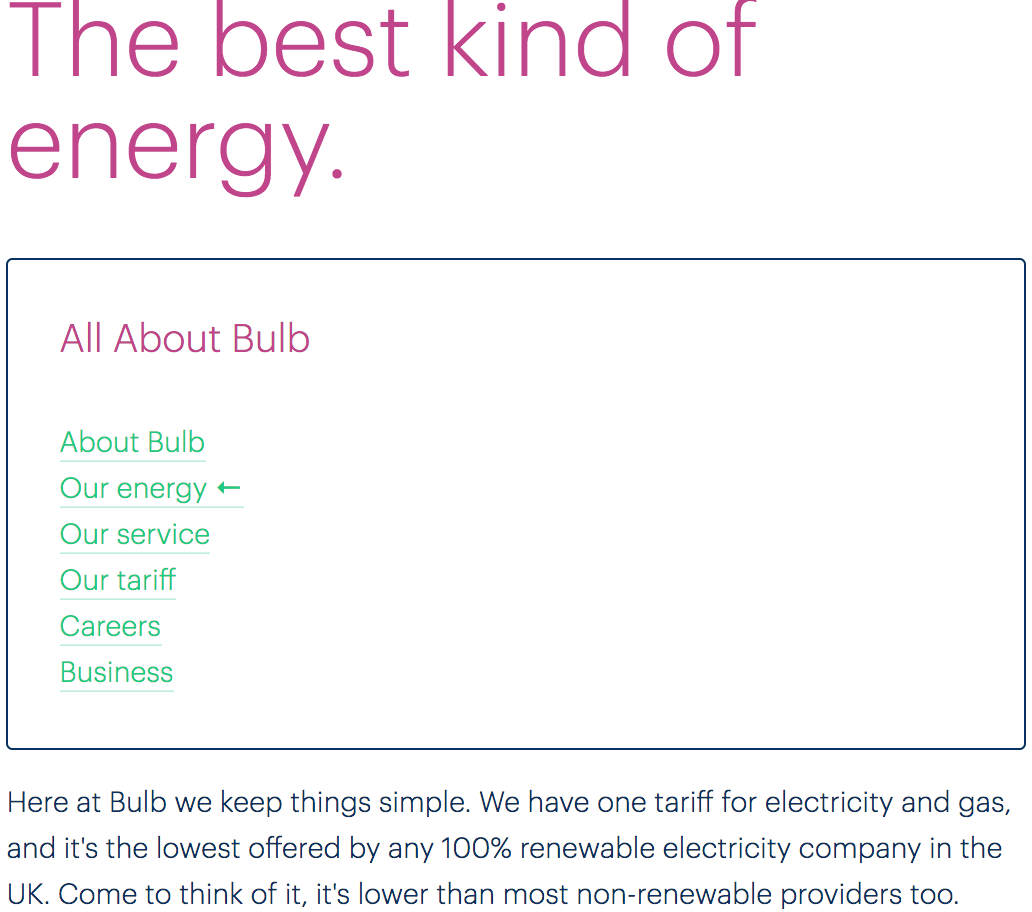
Each page, including the generic About Bulb page found as the first option within the dropdown menu, should include a navigation region within the page and including the same options to other About pages as the dropdown menu offers. This should be placed below the page’s main <h1> heading and include an <h2> heading of “All About Bulb” (or something similarly descriptive). See the markup template below for more details:
<nav aria-labelledby="in-page-nav-title">
  <h2 id="in-page-nav-title">All About Bulb</h2>
  <ul>
    <li class="dd-item"><a href="/about">About Bulb</a></li>
    <li class="dd-item"><a href="/energy" aria-current="page">Our energy</a></li>
    <li class="dd-item"><a href="/service">Our service</a></li>
    <li class="dd-item"><a href="/tariff">Our tariff</a></li>
    <li class="dd-item"><a href="/careers">Careers</a></li>
    <li class="dd-item"><a href="/business">Business</a></li>
  </ul>
</nav>
- The navigation region is labeled by the…
- …
<h2>’sid. This means that entering the navigation region by Tab and focusing the first item will elicit screen readers to announce “navigation, about bulb, list, 6 items, About Bulb, link” (or similar, depending on the screen reader software) - The
aria-currentproperty is an accessible way to indicate the current page/selected option (in this case, we are on the Our energy page). It will elicit “current” as part of the link information readout.
The below is an illustration of how this in-page navigation might look, including a simple style to indicate the current page via [aria-current]:

