Answer choices
Priority: 1
Introduction
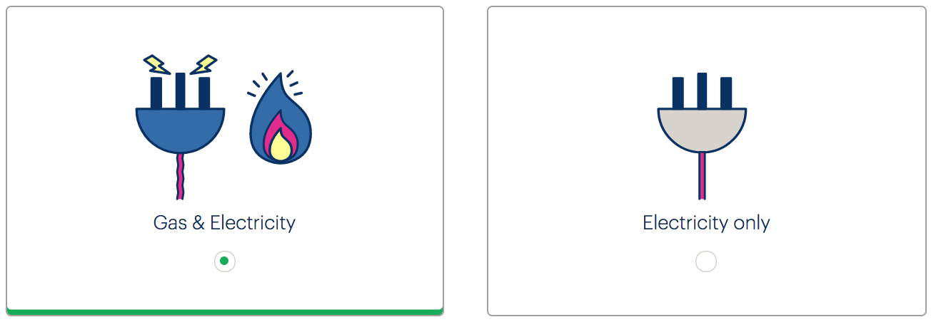
The Join site’s question screens include custom radio button-like components for selecting an answer. For example, the “My home uses” page offers a choice between “Gas & Electricity” and “Electricity only” (pictured).

Despite having the appearance of radio buttons (the familiar encircled dot design is used), these are custom components, built in Angular from <div> and <span> elements. A number of issues emerge:
- The controls do not offer any semantic information (role, state etc.) to be consumed by assistive technologies
- The controls are not keyboard accessible (they cannot be focused or activated)
- The controls are inefficiently designed and dependent on CSS
WCAG criteria
- 2.1.1 Keyboard (level A)
- 2.4.7 Focus Visible (level AA)
- 4.1.2 Name, Role, Value (level A)
Scope of the issue
These controls only appear on the Join site:
- https://join.bulb.co.uk/join/questions/my-energy
- https://join.bulb.co.uk/join/questions/my-home
- https://join.bulb.co.uk/join/questions/my-bedrooms
Fixing the issue
There is no reason why these controls should depart with standard radio button (<input type="radio" />) markup. With the help of some CSS, it is possible to create a simplified solution which communicates role and state, and is keyboard operable.
I wrote about this in Replacing Radio Buttons Without Replacing Radio Buttons. A demo that approximates the current design but using true radio buttons is provided below. Note that the arrow keys switch between selected radio button, and the Tab key focuses the selected radio button, as standard.
HTML
<fieldset>
  <legend><h1>My home uses</h1></legend>
  <div class="radios">
    <div class="radio">
      <input type="radio" name="energy" id="gas-and-elec" checked />
      <label for="gas-and-elec">
        Gas & Electricity
      </label>
    </div>
    <div class="radio">
      <input type="radio" name="energy" id="elec" />
      <label for="elec">
        Electricity only
      </label>
    </div>
  </div>
</fieldset>
</form>
- The page’s heading should be an
<h1>, not an<h2>. It is used to form the<legend>. - The radio must be associated to the…
- …label using
forandid - The input must come directly before the label in the markup for the CSS adjacent sibling combinator to work (see below)
CSS
(Only the key CSS is included here.)
[type="radio"] {
  position: absolute;
  white-space: nowrap;
  height: 1px;
  width: 1px;
  overflow: hidden;
  clip-path: inset(100%);
  clip: rect(1px, 1px, 1px, 1px);
}

label {
  display: block;
  padding: 2rem;
  border: 1px solid #666;
  border-radius: 0.5rem;
  margin: 0.5rem;
  cursor: pointer;
}

label::after {
  content: '';
  display: block;
  margin: 0.25rem auto 0;
  width: 1rem;
  height: 1rem;
  border: 1px solid;
  border-radius: 50%;
}

[type="radio"]:checked + label {
  border-bottom: 0.25rem solid #19ac58;
}

[type="radio"]:checked + label::after {
  background-color: #19ac58;
  box-shadow: inset 0 0 0 0.25rem #fff;
}

[type="radio"]:focus + label {
  box-shadow: 0 0 0 0.125rem #ca488d;
}
- The radio button is hidden from view using an accessible technique (this is moved to a
classin Missing and placeholder labels) - The
pointercursor indicates to mouse users that the whole box can be clicked, avoiding potential cognition issues - A proxy radio button design is included using pseudo-content
- Clear
checked… - …and
focusstyling is provided. See Focus styles
