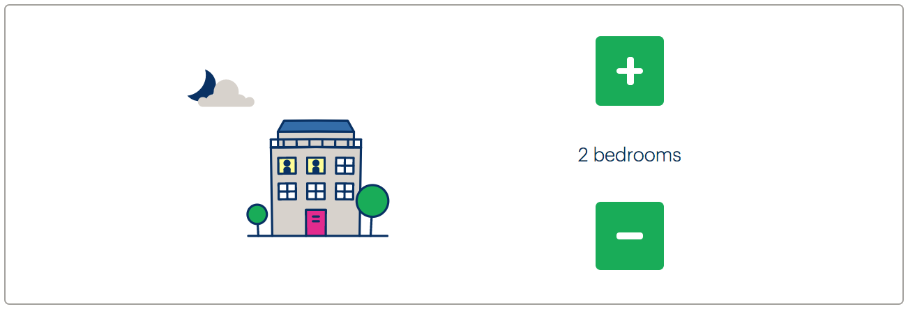
Bedrooms stepper
Priority: 1
Introduction
The Join Site provides a “stepper” component for incrementing and decrementing the number of bedrooms the user’s house or flat contains (pictured).

There are a number of issues relating to this implementation:
- The plus and minus buttons do not have focus styles
- The plus and minus buttons do not have labels
- The purpose of the controls is not reported to screen readers
- The updating of the number of bedrooms is not reported to screen readers
It is also unintuitive that the values ‘cycle’. That is, if I’m on “5+ bedrooms” and I try to add another bedroom, the value cycles back to “1”. This is likely to cause confusion since it means each button does the opposite of what its label claims, under certain conditions.
WCAG criteria
- 2.4.7 Focus Visible (level AA)
- 3.3.2 Labels or Instructions (level A)
- 4.1.2 Name, Role, Value (level A)
Scope of the issue
Only the Join Site is affected, at https://join.bulb.co.uk/join/questions/my-bedrooms.
Fixing the issue
The component needs to be restructured as a fieldset with a legend, as in Answer choices. The other provisions are included in the below code example, with notes to follow.
<form>
  <fieldset>
    <legend><h1>The number of bedrooms I have is</h1></legend>
    <button type="button" aria-label="add a bedroom" aria-describedby="current" id="add"></button>
    <div role="status" id="current">
      2 bedrooms
      <span class="visually-hidden">currently chosen</span>
    </div>
    <button type="button" aria-label="remove a bedroom" aria-describedby="current" id="remove"></button>
  </fieldset>
  <button type="submit">Continue</button>
</form>
- The page’s
<h1>forms the legend/group label for the button controls. The wording of the<h1>has been changed in accordance with Wording. - Screen reader-accessible labels are provided via
aria-label. - The buttons are each described by the
#currentelement, so when they are focused the screen reader user is made aware of the current number of bedrooms chosen. - The
#currentelement is also an ARIA live region, meaning that changes to its text are announced as feedback in screen readers. See Form errors for more on live regions. - To make the description more clear non-visually, some visually hidden text is provided to clarify. The special
.visually-hiddenclass is set out in Form errors. - Each button has
type="button". This prevents browsers from seeing the buttons as submit buttons and using them to submit the form.
Demo
The following is provided for testing in screen readers. The styling is not intended to match in this case. To test the demo in VoiceOver, press CMD + F5 and use the Tab and Enter keys to operate the component controls
