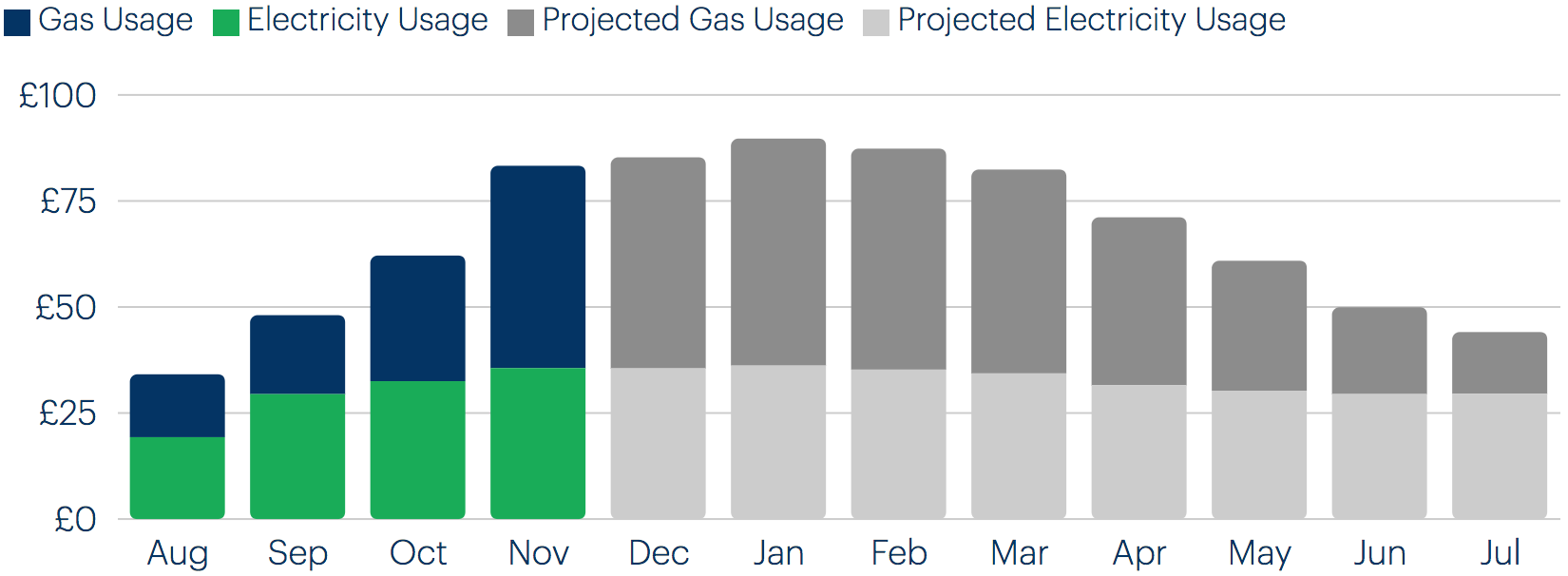
My Usage chart
Priority: 2
Introduction
The Bulb sites use a number of charts and graphs, primarily to illustrate fairly simple concepts. However, the energy usage chart found in the Account dashboard’s My usage screen communicates critical, detailed information. It — or an alternative for it — therefore needs to communicate the information it represents in a detailed and structured way.
Commonly, complex charts are accompanied by invisible data tables, intended for blind screen reader users. This is a mistake, because not only blind users benefit from a tabular representation of the data. Instead, we should offer a choice between a chart and table view of the data and controls to switch between these views.
-
Offer choice
:
Consider providing different ways for people to complete tasks, especially those that are complex or non standard.
There is often more than one way to complete a task. You cannot assume what someone's preferred way might be. By providing alternatives for layout and task completion, you offer people choices that suit them and their circumstances at the time.
WCAG criteria
- 1.1.1 Non-text Content (level A)
- 1.3.1 Info and Relationships (level A)
- 1.3.3 Sensory Characteristics (level A)
Scope of the issue
The usage chart is found on the Account dashboard’s My usage screen.
Fixing the issue
A set of radio button controls should be provided to switch between chart and table views. With the data table option available, only a terse text alternative for the chart is necessary. The highlighted code is what I have added.
The chart with text alternative
<svg class="recharts-surface" role="img" aria-label="Bar chart showing electricity and gas usage over a 12 month period." focusable="false" width="819" height="303.3333333333333" viewBox="0 0 819 303.3333333333333" version="1.1">
  <!-- SVG chart content -->
</svg>
The data table
(The example code just shows rows for August - October)
<table>
  <tr>
    <td></td>
    <th scope="col">Electricity</th>
    <th scope="col">Gas</th>
    <th scope="col">Total</th>
  </tr>
  <tr>
    <th scope="row">August</th>
    <td>£19</td>
    <td>£15</td>
    <td>£34</td>
  </tr>
  <tr>
    <th scope="row">September</th>
    <td>£29</td>
    <td>£19</td>
    <td>£48</td>
  </tr>
  <tr>
    <th scope="row">October</th>
    <td>£33</td>
    <td>£30</td>
    <td>£62</td>
  </tr>
</table>
- Each table header must be a
<th>element. - Column table headers need their direction explicitly set using
scope="col". - Row table headers need their direction explicitly set using
scope="row". - The data table should use full — rather than abbreviated — labels: “August” in place of “Aug”.
Demo
| Electricity | Gas | Total | |
|---|---|---|---|
| August | £19 | £15 | £34 |
| September | £29 | £19 | £48 |
| October | £33 | £30 | £62 |
The radio buttons
The radio buttons for choosing between the two panels, chart and table, can use standard <input> markup. No group label is necessary, since the purpose of the controls can be inferred from the context. Styling such controls is covered in detail in Answer choices. Below is a demo.

| Electricity | Gas | Total | |
|---|---|---|---|
| August | £19 | £15 | £34 |
| September | £29 | £19 | £48 |
| October | £33 | £30 | £62 |
