List structure
Priority: 2
Introduction
Along with headings, lists give structure to a web page. They group items together so users know they are related or equivalent.
Assistive technology users find lists especially helpful because most software will identify a list semantically, enumerate its items, and provide shortcuts for navigating between the list items. The NVDA screen reader provides the L shortcut key for navigating between lists, and the I shortcut key for jumping between list items.
Where lists are not used appropriately, the structure of content can be unclear and difficult to traverse.
WCAG criteria
- 1.3.1 Info and Relationships (level A)
Scope of the issue
Marketing site
The navigation schema for the marketing site (pictured) does not use list markup. While some assistive technologies will identify the <nav> and enumerate the links within it, this is no substitute for a <ul> and <li>s to wrap each item.

This also applies to the social media navigation region, but does not apply to the Account dashboard navigation.

That the navigation is constructed differently across the sites represents an issue of inconsistency. Note the “Be consistent” inclusive design principle:
-
Be consistent
:
Use familiar conventions and apply them consistently.
Familiar interfaces borrow from well-established patterns. These should be used consistently within the interface to reinforce their meaning and purpose. This should be applied to functionality, behavior, editorial, and presentation. You should say the same things in the same way and users should be able to do the same things in the same way.
In addition, the “1, 2, 3 Switch” section (pictured) features a list of illustrated steps, but they are marked up as plain text within <div> elements.

Join site
As in the “1, 2, 3 Switch” section, the Join site’s Welcome page includes a set of features/benefits not formed as a list (pictured).

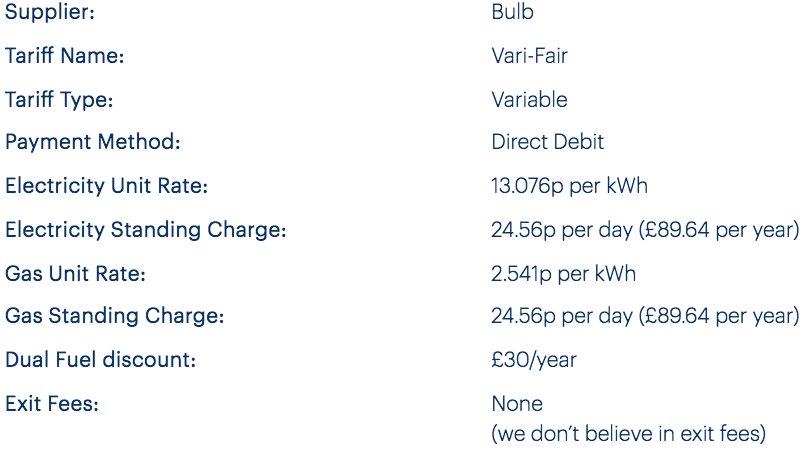
The “Tariff info” dialog includes what looks like a definition list, but each row is a <ul> and the keys/values separate <li> elements, meaning there are twice as many ‘items’ as there should be.

Account dashboard
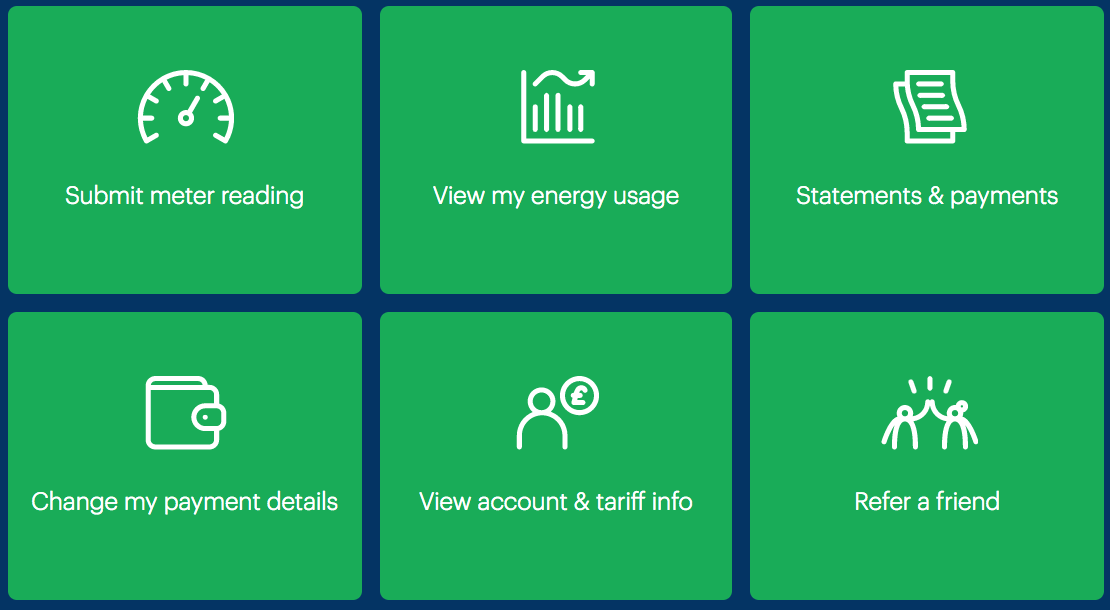
On the Dashboard page, a grid of green boxes are presented as account management options (pictured). Although they are equivalent choices, they are not marked up as a list of options (inert <div> markup is used instead).

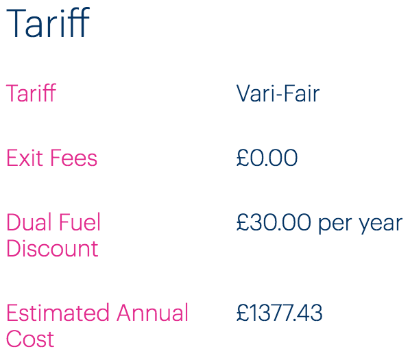
On the Tariff info page, ‘layout tables’ are used to place keys and their values side by side (pictured).

This is an incorrect use of <table> semantics, and should instead be marked up as a definition list (using <dl>).
Fixing the issue
Navigation region lists
- Ensure all instances of
<nav>regions use list markup. - In the case of the Account dashboard grid, make it a
<nav>and use a combination of list markup and headings to give a clear, easily navigable structure. For extra credit, differentiate different<nav>regions with labels. See the code example and notes to follow.
(Dashboard example; code is simplified and elided)
<nav aria-labelledby="manage-heading">
  <h2 id="manage-heading">Manage your account</h2>
  <ul>
    <li>
      <h3><a href="[url]">Submit reading</a></h3>
    </li>
    <li>
      <h3><a href="[url]">View my energy usage</a></h3>
    </li>
    <li>
      <h3><a href="[url]">Statements and payments</a></h3>
    </li>
    <!-- other options -->
  </ul>
</nav>
- The navigation region is labeled using the
<h2>heading. On focusing the first link inside the region, assistive technologies will communicate “manage your account, navigation, list, 6 items, Submit your reading, link” or similar. - For this relationship to work, the value of
aria-labelledbyand the value of the<h2>’sidneed to match.
Definition lists
On the Account dashboard Tariff info page, use <dl> markup for each set of keys/values. The “Tariff” example:
<h2>Tariff</h2>
<dl>
  <dt>Tariff</dt>
  <dd>Vari-Fair</dd>
  <dt>Exit Fees</dt>
  <dd>£0.00</dd>
  <dt>Dual Fuel Discount</dt>
  <dd>£30.00 per year</dd>
  <dt>Estimated Annual Cost</dt>
  <dd>£1377.43</dd>
</dl>
