Payment settings issues
The following is an accessibility review of the payment settings pages found from dashboard/payments-and-statements/payment-settings.
Heading structure
Main page
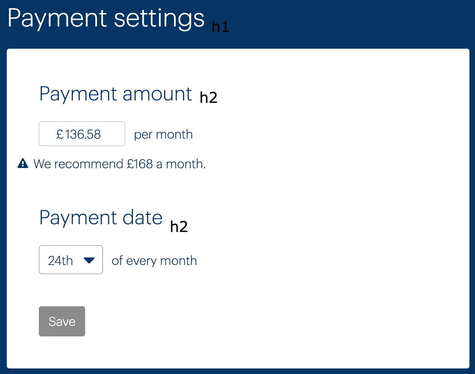
The heading structure is not correct. “Payment Settings” should be an <h1> (because it is the main heading of the page) and both “Payment amount”, “Payment date”, and “Payment details” should be <h2> (as subsection headings directly under “Payment Settings”). See below (“Payment details” not pictured).

Setup New Direct Debit page
“Setup New Direct Debit” should be an <h1> (and “Confirm New Direct Debit Details” on the confirmation page). The labels are currently <h4>s, which is incorrect in terms of hierarchy. Either remove the headings and just have <label>s or mark them up as <h2> headings with <label>s inside them.
(Note: the TextInput component does not currently support labels-in-headings. Should probably be possible.)
Labels
The form markup currently does not make good use of labels to ensure screen reader users have fields identified to them on focus. This is the job of the <label> element, which takes a for attribute that should point to the field’s id. The current mechanism of having a label followed by an input, then “per month” or similar is not recommended. Instead, reword the headings place labels within them. Full examples to follow, with notes.
Payment amount example
<h2>
  <label for="payment-amount">
    Monthly payment amount
    <span>We recommend £168 per month</span>
    <span class="visually-hidden">(in pounds)</span>
  </label>
</h2>
<input id="payment-amount" value="136.58" />
- The heading should be an
<h2>(See Heading structure, above). - The
<label>needs aforattribute, pointing to the input’sid. - The description should be above the input. Below the input is only for errors, as prescribed by the
TextInputcomponent. - This is for clarification to screen reader users who do not have access to the
£sign displayed. See for theclassthat makes this work. - (See 2)
Payment date
<h2>
  <label for="payment-date">
    Monthly payment date
  </label>
</h2>
<input id="payment-date" value="136.58" />
Setup New Direct Debit page
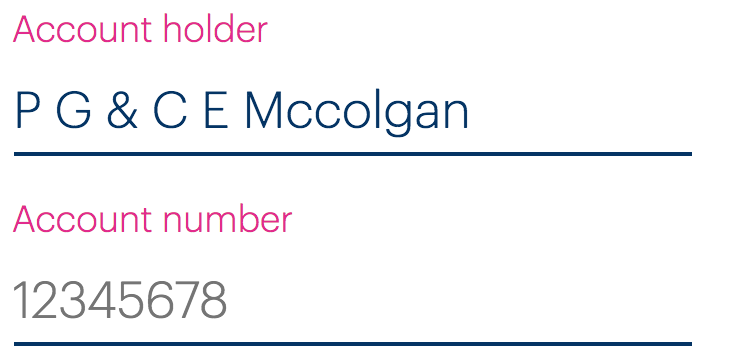
The same rules as outline above should be followed for the (pictured) form elements. Be sure to adopt the new “boxy” input design by using the TextInput component from the design library.

The sort code example (pictured) is a special case because it is a group of inputs. “Sort code” should be a group label, provided via a <legend>. The individual inputs will need their own (invisible) labels. See the code below.
<fieldset>
  <legend>Sort code</legend>
  <div>
    <label for="first-digits" class="visually-hidden">First two digits</label>
    <input id="first-digits" placeholder="00" />
  </div>
  <div>
    <label for="second-digits" class="visually-hidden">Second two digits</label>
    <input id="second-digits" placeholder="00" />
  </div>
  <div>
    <label for="third-digits" class="visually-hidden">Third two digits</label>
    <input id="third-digits" placeholder="00" />
  </div>
</fieldset>
- The
<legend>describes the entire group of inputs - The invisible
<label>clarifies what each individual input is for to screen reader users
The checkbox (pictured below) should use the new Checkbox component (currently it appears to be accessible, but does use two labels for some reason).

Errors
You should be using TextInput from the design library to create text inputs. This has many of the described features built in, including the accessible display of error messages, using aria-describedby to associate the error message to the input and aria-invalid to signify invalidity on the input.
The following is an approximation of how TextInput marks this up, using “Payment amount” as an example.
<h2>
  <label for="payment-amount">
    Monthly payment amount
    <span>We recommend £168 per month</span>
    <span class="visually-hidden">(in pounds)</span>
  </label>
</h2>
<input id="payment-amount" value="136.58" aria-invalid="true" aria-describedby="payment-amount-error" />
<div class="error" id="payment-amount-error">Invalid monthly payment</div>
aria-invalidmust be applied to the invalid fieldaria-describedbyassociates the input to the error using the error’sid- (See 2)
List structure
The details under “Payment details” (pictured) need to be marked up as a definition list.

Lists and definition lists give structure to screen reader users, who then find the content easier to understand and navigate.
Here’s how the code should look:
<dl>
  <dt>Account holder</dt>
  <dd>P G & C E Mccolgan</dd>
  <dt>Account number</dt>
  <dd>*****879</dd>
  <dt>Sort code</dt>
  <dd>56-00-41</dd>
</dl>
- The
<dt>(definition title) is the key/label for the definition - The
<dd>(definition) is the value
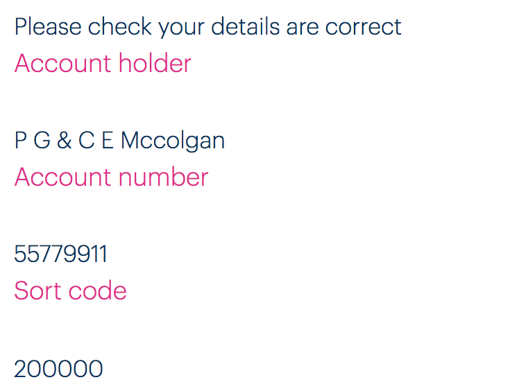
The confirmation page for changing the direct debit details (see below) should also use this structure (and have a similar visual design; the current one is very difficult to understand).

Routing
You will need to manage focus between routes by focusing the <h1> on each screen and updating the <title> to something that is more descriptive of the exact screen. For example: “Bulb Account - Confirm New Direct Debit Details” instead of the generic “Bulb Account — Edit Payment Details”. More detail on routing here: Routing.
