Text alternatives
Priority: 1
Introduction
For blind users, textual alternatives of important visual information must be provided. Composing that text effectively is a question of context.
For example, a logo that is intended as a study in logo design should include a textual alternative — typically via an <img> tag’s alt attribute — that describes the features of the logo, such as the colors and typography. For Bulb’s logo this might read something like, ” expressive, hand written text, in white, and featuring hooped ascenders”.
On the other hand, where the logo is used as the content of a link to the site’s home page, “Bulb home page” would suffice. That is, the action of the link is pertinent to the user, not the design of the lettering.
Decorative images, which include no salient information, are obstructive to non-visual users and must be removed from screen reader output. The only reliable way to do this is by providing alt="" (empty value). Omitting the alt attribute altogether will result in browsers and screen readers falling back to reading the src value, which is rarely helpful.
Be careful to avoid redundant alternative text. Where the same information is provided as text and an image, you should consider the image decorative (see above).
WCAG criteria
- 1.1.1 Non-text Content (level A)
Scope of the issue
Marketing site
Home page
The switch steps (pictured) have identical, redundant alternative text to the visible text provided. You must use an empty (alt="") value for each of these.

The ‘listening’ and ‘best of’ illustrations (pictured) are decorative, but omit the alt attribute, meaning their role and src will be announced. Include alt="" to suppress this.


The social media links (pictured) have strange alternative text, derived from the SVG data. For example, the Facebook link is just “bulb”, and the YouTube link is a random string of characters. In each case, use the form “Bulb on [social media company]” and apply this label as an aria-label attribute to the outer SVG element (aria-label="Bulb on [social media company]").


The Cost of energy for a typical home chart is deceptively simple in terms of the information it imparts. Where other charts might need an alternative presentation of the data, as a table, this <canvas> element can simply be given role="img" and an aria-label for the alternative:
<canvas role="img" aria-label="Chart showing the cost of more than 100 energy providers. Bulb is not only in the 10 cheapest providers, but is also 100% green.">
</canvas>
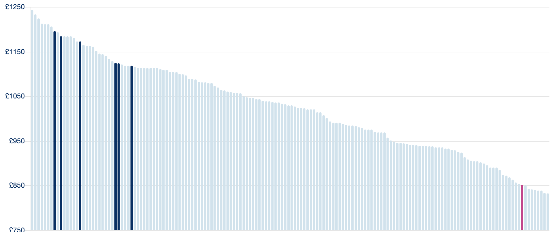
Since the key for the chart (pictured with the chart above) and title for the chart (“Cost of energy for a typical home”) are no longer needed non-visually, they can be removed from screen reader output with aria-hidden="true".
<ul class="chart-labels" aria-hidden="true">
  <li><div class="legend-swatch label--navy"></div>Big Six standard tariff</li>
  <li><div class="legend-swatch label--grey"></div>Others</li>
</ul>
About → Our energy
The “Greening up the grid” illustration (pictured) is decorative but omits an empty (alt="") attribute. Ensure that this is present to suppress readout of the image.
The “Renewable energy providers” chart (pictured) is deceptively simple. The simple solution is to place role="img" and an aria-label with a value of “Chart shows that Bulb’s energy is one of only four 100% green energy providers”.
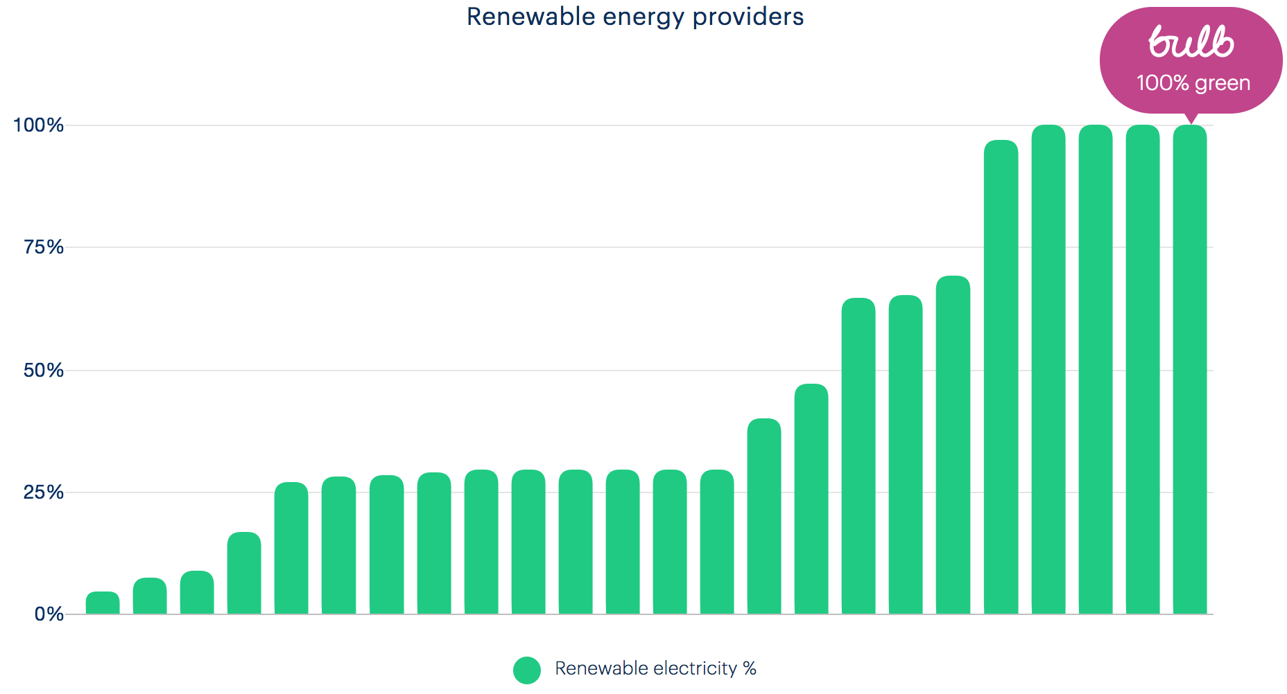
In addition, hide the now unnecessary key (“renewable electricity %”) and title (“Renewable energy providers”) from assistive technologies using aria-hidden="true" on each containing element.
About → Careers
The living wage and ‘certified B’ images have a filename as the alt and a missing alt, respectively. These are not decorative images, so should have “We are a living wage employer” and “Certified B Corporation” alternative texts.

The “Come make energy better” and “Working At Bulb” photos have poor alternative texts of “Bulb March 3rd-147.jpg” and “Bulb March 3rd-262.jpg”, respectively. You can consider these images decorative and supply empty alternatives (alt="").


About → Business
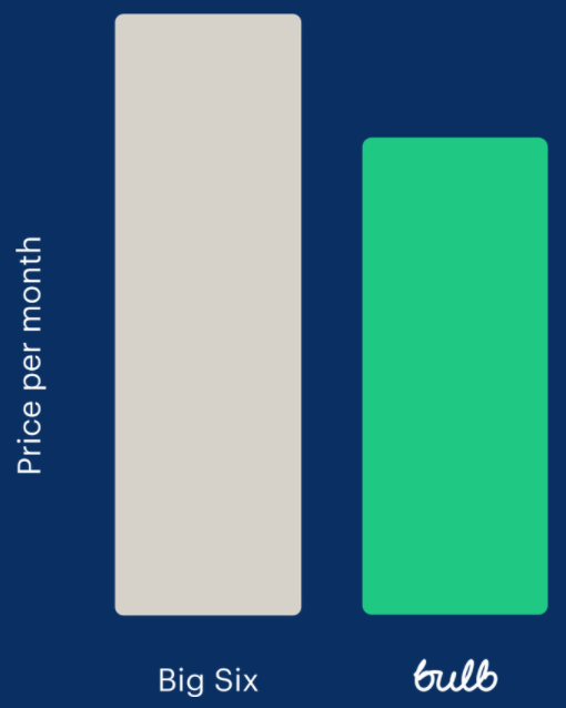
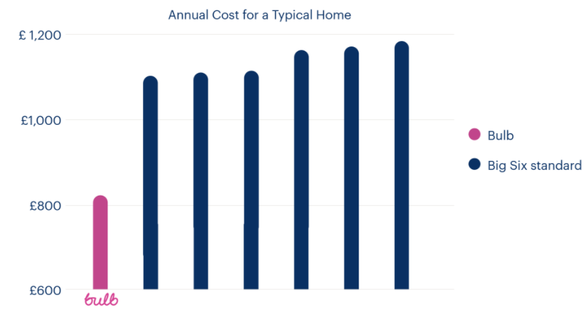
The alternative text for the ‘Big Six versus Bulb’ chart (pictured) is inadequate as simply “bulb-business-chart”. Since the information it provides (that Bulb’s prices are 20% cheaper) is covered in the accompanying text, it can be treated as decorative. Empty the alt attribute but leave it in place (alt="").
The photo of the beach is also decorative and should have alt="".
Trust Pilot instances
The Trust Pilot widget (found on the Home page and About → business page) is an <iframe> with a lot of content and JavaScript, amounting to 80KB+ (!) of payload. The purpose of the widget is simply to link to Bulb’s Trust Pilot page.

In which case, I recommend the <iframe> is replaced by a simple image, linked to that page. See the code example below with the
Join site
The graphics throughout the Join site (example pictured) are rendered as CSS background images on <div> elements. Since they are exclusively decorative images, this is not an issue in terms of alternative text (they already will not be announced). However, background images are typically eliminated when users (some of whom with impaired vision) activate Windows High Contrast Mode.

Since the graphics assist comprehension for sighted users, it is recommended that the high contrast mode-proof method of supplying <img> tags with alt="" is employed.
One exception is the price comparison bar chart found on the “Switch Now” page. This must have a proper description in a form similar to “Bar chart shows Bulb’s price at around £80 compared to the prices of the big six energy companies, all significantly over £1000”.
Account dashboard
The My usage chart is handled in the Component issues section because it needs a more complex alternative text approach.
Fixing the issue
For convenience, solutions are included inline in the Scope of the issue section, above.
