Wording
Priority: 3
Introduction
It’s not enough that elements in a web page’s HTML are marked up correctly. Where they provide textual labels, these labels need to be readable and descriptive.
- Headings must clearly describe the sections they introduce
- Labels for links, buttons and form elements must clearly describe the purpose of those controls
- Page titles must sufficiently describe the page and its purpose
Since headings and links are aggregated into lists by screen reader software, it is important they make sense independent of context. For example, “It’s Great!” may make sense proceeding a paragraph where the “it” of the heading is defined, but will be mysterious as a heading in a reductive list of just the headings present in the page. Similarly, links reading “click me” or “more” are of little use in an aggregated list, especially where there are many sharing the same generic label.
The page’s main (<h1>) heading must be a subset of the page’s <title>. Ordinarily you would include the name of the site along with the name of the page, e.g. “Bulb: About Our Energy” or “About Our Energy — Bulb”. This way, a user with many tabs open know which pages belong to which sites. The name of the page should be similar to the content of the <h1>.
Finally, it is important that parts of the interface are identified consistently, using the same terminology. This includes pairing the terminology in link text to the destination page’s <title> and main heading text.
WCAG criteria
- 2.4.2 Page Titled (level A)
- 2.4.4 Link Purpose (In Context) (level A)
- 2.4.6 Headings and Labels (level AA)
- 3.2.4 Consistent Identification (level AA)
Scope of the issue
Marketing site
- Home page (✖️ The “Read more” link in the press section doesn’t mean anything out of context.)
- About → Our energy (✖️ The page’s main heading is not “Our energy” or anything similar to the
<title>; the<title>includes the imperative “Join Bulb”, which is not the primary purpose of the page.) - About → Careers (✖️ The main heading “Bulb is growing” does not use the “careers” term of the
<title>and navigational link text, which those with cognitive impairments may find confusing; the<title>includes the imperative “Join Bulb”, which is not the primary purpose of the page.) - About → Business (✖️ The
<title>includes the imperative “Join Bulb”, which is not the primary purpose of the page.)
Join site
- Between each screen, the page URL and the page content changes, but the
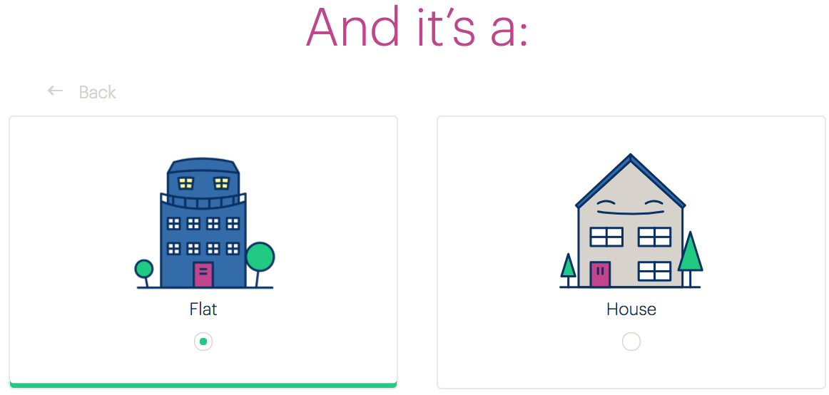
<title>remains “Bulb — Get A Quote”. - The second and third question pages (pictured) have the main headings “And it’s a:” and “With:” respectively, which is fragmentary and unhelpful, especially given that screen reader users are likely to have content in the page preceding these headings read to them as they arrive.

Account dashboard
- On the Login page, the page
<title>is “MyBulb — Your account” suggesting the user is already logged in. - On the Submit an electricity meter reading page, the back button reads “Back to MyBulb”, but points to the page where you choose which type of reading — gas or electricity.
Fixing the issue
Marketing site
- Remove the ‘Join Bulb’ terminology from the
<title>s. This imperative only really applies to the Join site and may cause confusion when used too prolifically in this way. - Avoid generic terms like “Read more”. The link under the press logos can read something like “Bulb press”, “In the press”, “More press mentions”, or similar.

Join site
- Add a third part to each
<title>identifying the specific screen in the form “Bulb — Get A Quote — [specific page description]”. For example, “Bulb — Get A Quote — Bedrooms” for the bedrooms screen. - Avoid trying to compose sentences across screens/pages. This will not work for many assistive technology users, and all sorts of users will simply forget what came before in the sentence. Try headings like “The energy I use is”, “I live in a”, and “The number of bedrooms I have is”.
Account dashboard
- Change the login page title to something similar to “MyBulb — Log in to your account”.
- Instead of changing the wording of the back button on the reading page, actually link back to the main dashboard page. There is no need to step back through the intermediary page.
