Form Validation
The Bulb sites should each conform to the same set of prescribed form validation behaviors as set out below. These behaviors are optimized for usability and accessibility and should be implemented consistently.
Let users submit
There are a number of usability issues associated with disabled (submit) buttons.
- Difficult to discern as disabled (especially when color blind)
- Do not tend to explain why they are disabled
- Not focusable, therefore not easily discoverable using a screen reader
- More here
Instead of disabling the submit button until the form is valid, we should allow users to attempt submission and tell them there are errors where they arise. By using instant error handling (see below) few users should reach the end of the form with invalid fields.
Types, descriptions, and placeholders
Ideally, we don’t want to be throwing and communicating errors at all. So it is important to guide the user from the outset and help them not make mistakes. Using correct input types, descriptions, and placeholders should mitigate error handling.
- Types: Using an appropriate type has benefits such as suppressing the entry of incorrect characters, and displaying an appropriate virtual keyboard configuration. Use
type="number"for fields expecting numbers only. - Descriptions: These should appear inside the
<label>element, below the main label text and above the input itself. Use a sentence or two to explain what input is expected. Not necessary for common fields such as name or email. The<TextInput>component in the pattern library comes with adescriptionprop. - Placeholder: Avoid using the
placeholderelement as a substitute for the<label>. Instead, where appropriate, provide an example of valid entry. For example:e.g. Heydon666for a username field. The “e.g.” prefix is important because it makes it explicit that it is a suggestion only, and not a prepopulated value.
Example
By making the description part of the <label> it is available to assistive technologies upon focusing the field. In the following example, the description is demarcated using a <small> element. This would most likely be set to display: block.
<label for="discount-code">
  Discount code
  <small>The five digit code sent to you by email.</small>
</label>
<input type="number" id="discount-code" name="discount-code" placeholder="e.g. 56291" />
Note that the least important part of the above example is the placeholder which can be omitted in most cases. The description takes precedence for inputs that need explaining.
Before submission
For each field, ensure that:
aria-invalidis not present on any fieldsaria-requiredis set totrueif applicable (set it on the parentfieldsetfor radio groups where no default radio is selected). In some circumstances, you may want to append the label with an asterisk; a conventional way to show it is required. However, since optional fields are less common, it is more important to pick them out, by appending ”(optional)”.- Complex input requirements are handled with a description inside the
<label>, or<legend>for radio button fieldsets - A live region is present in the page, directly above the submit (and cancel) button (see General error message, below)
Also ensure the parent form has the novalidate attribute. We are using our own validation process and do not want inconsistently implemented HTML5 validation messages to appear.
No instant error handling
We have deemed instant error handling — as the user types — aggressive and distracting. In some cases, such as positive validation on a name field after one character has been typed, it can also be confusing (especially to users with cognitive impairments).
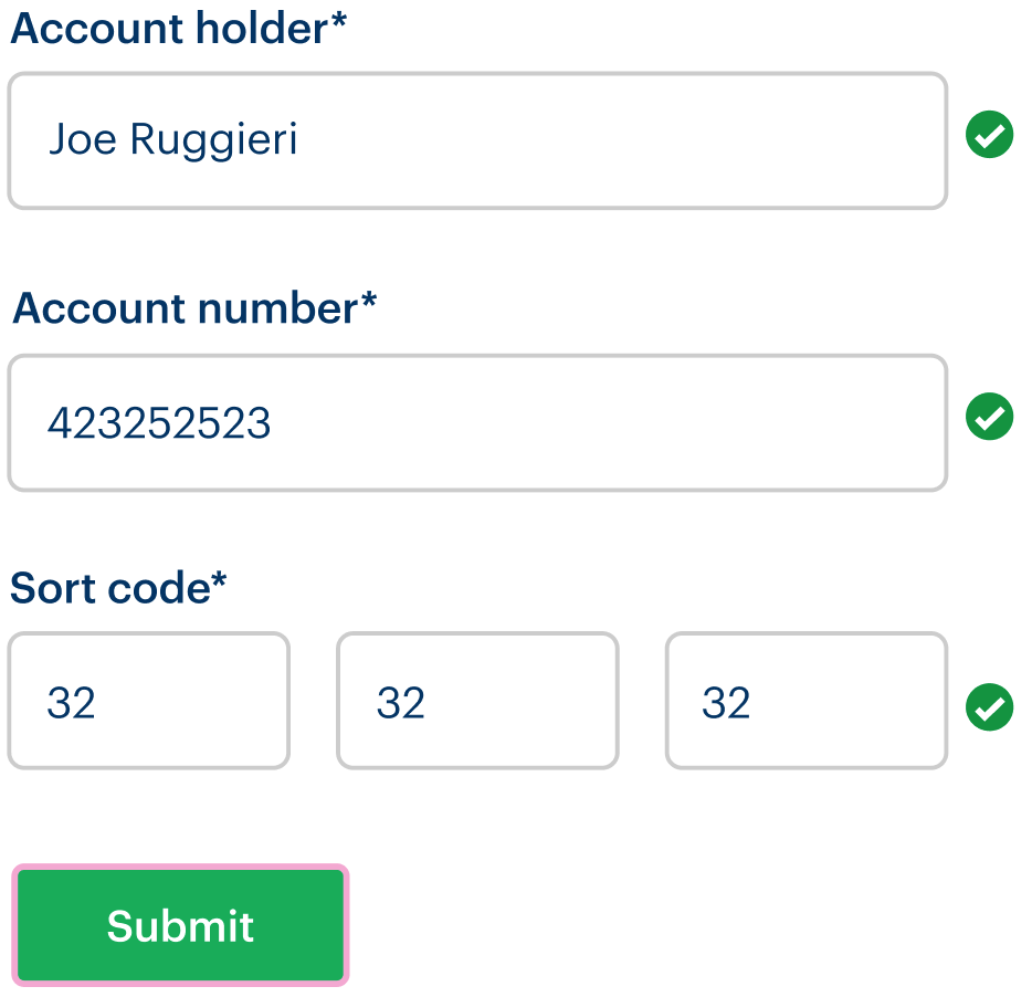
Instead, fields that are set to validate and display error (and/or) success messages/icons should only do so when the field is blurred. As standard, no positive validation should occur on blur; only mistakes should be highlighted. In some cases, where a very specific form of input is required, positive validation can be performed on blur. Usually this is where a number of fields need to match up mutually, such as a password and password confirmation fields, or a set of bank details.

See the design kit for the standard and positive validation flows illustrated.
While screen reader users will not be aware of the validation error until they refocus the field, they will know to do so having received the general error message after attempted submission (defined below).
On submission (with errors)
General error message
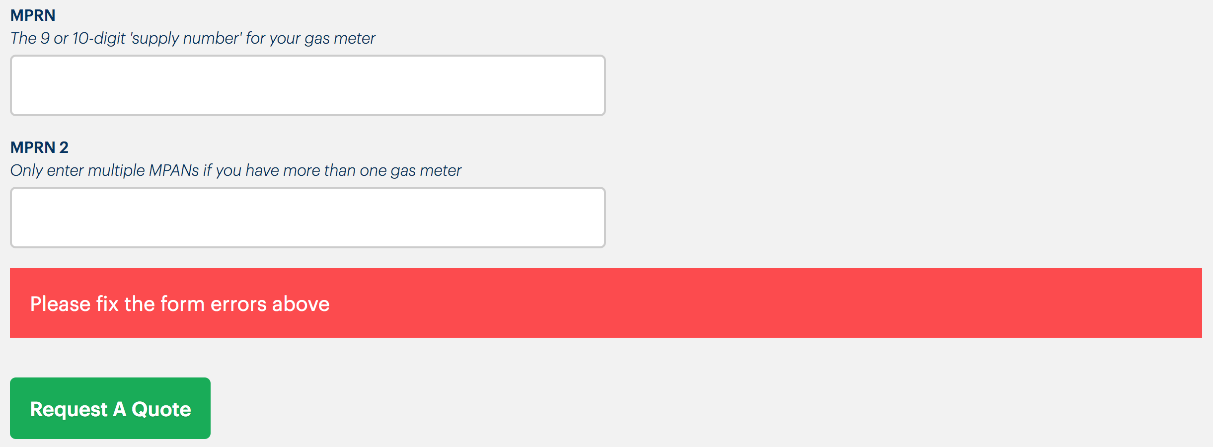
On submission, if there are still individual errors present, a general message announcing the presence of errors needs to be included, as a screen reader accessible live region.
Be sure to place this message component directly above the submit (and cancel) buttons so that the user does not need to scroll in order to see it. See the example from the marketing business page below.

Note that the live region that makes this message accessible should already exist in the page. The message is inserted inside the live region for it to announce correctly in screen readers. If you include the live region with the message, it will not work.
<!-- before insertion -->
<div role="alert" aria-live="assertive">
</div>

<!-- after triggering -->
<div role="alert" aria-live="assertive">
  <p class="message">
    <svg aria-label="error">...</svg>
    Oops! Your form has some errors. Please fix them before continuing.
  </p>
</div>
Individual fields
After attempted submission, for each field ensure the following. Note that empty required fields would now be considered as invalid, and display error messages.
- Where the field is valid:
- The field element/input, or
<fieldset>for radio buttons, has noaria-invalidattribute
- The field element/input, or
- Where the field is invalid or empty but required (including for radio button sets):
- The field element/input, or
<fieldset>for radio buttons, hasaria-invalid="true" - An error message is associated to their input/field, or
<fieldset>for radio buttons, usingaria-describedbywith a value of the error message element’sid - The error message appears directly below the input or
<fieldset>in question - The error message should be accompanied by an error symbol (see the illustration of
<FormGroup>below)
- The field element/input, or
Invalid radio buttons example
This is the pattern needed for invalid — because a choice is required — radio button <fieldset>s.
<fieldset aria-describedby="error" aria-required="true" aria-invalid="true">
  <legend>Output format</legend>
  <div>
    <input type="radio" name="format" id="txt" value="txt">
    <label for="txt">Text file</label>
  </div>
  <div>
    <input type="radio" name="format" id="csv" value="csv">
    <label for="csv">CSV file</label>
  </div>
  <div>
    <input type="radio" name="format" id="html" value="HTML">
    <label for="html">HTML file</label>
  </div>
  <p id="error">You must choose one option</p>
</fieldset>

Validation flow in pictures
The following diagram steps though eight steps of a typical form validation flow. Each numbered step is described below the diagram.
- The first (required) field is focused, showing the blue focus style.
- When the field is blurred after the user has not entered input, the error style and message appears.
aria-invalid="true"is applied to the input, and the error message is associated with the input’sidusingaria-describedby="[the id]". - The user could go back up straight away to fix the field, but in this case continues to fill out the second field which has now been focused.
- When this Last name field (which is simply required and has been filled out) is blurred, showing no successful message as it is not needed, and the user begins to type into the email field.
- The field is filled out correctly (a valid email format is used).
- When the submit button is pressed, there are still errors in the form. In which case, the general error message (inserted in an ARIA live region, see above) appears. This alerts sighted and blind users to move back up the form to fix the errors.
- The user moves focus up through the successfully completed fields and focuses the first, invalid field. The focus style overrides the error style but the message remains to help instruct the user in fixing the error. This is particularly important for fields expecting a certain format and requiring specific instructions.
- When the corrected field is blurred, the error style is removed, as well as
aria-invalid="true". The general error message disappears because it is no longer applicable. The user is free to submit. Pictured: the second field is focused on the (keyboard) user’s way down to the submit button.
After submission (no errors)
If submission was successful, this needs to be clear. There are a few things to consider depending on the circumstances.
- Does the form itself disappear (is it removed from the DOM)? You should programmatically focus a success message such as “Password successfully updated” (using a React
refandfocus(), typically) - Is the user redirected to a new page? Make sure that page includes some kind of success message. The easiest way is to probably include it in the page
<title>(e.g.<title>Your account settings (you successfully changed your password)</title>). An additional flash message in the page (below the main title) is recommended.

